Startup branding is the decision about what the company promises and to whom, and the translation of that decision into a name, messaging, a visual language, a website, an investor deck and the product itself. It does not start with a logo, and it does not all have to happen on day one.
The question founders ask us most is not “how do we do branding” but “how much of it do I need right now”. This guide answers it by stage: what is essential before the seed, what you add after it, what waits for Series A, and what changed in 2026, when anyone can generate a logo and a website in a day. Along the way there are examples from startups we have worked with at Spank.
In short
- What it is: startup branding defines the company’s promise and carries it into the name, the messaging, the visual language and every place an investor, customer or candidate meets the company.
- When to start: positioning from day one, because it costs nothing and everything else rests on it. The investment in design grows with the stage.
- What order: positioning before the name, the name before the logo, and one system before you build a website, a deck and an interface.
- What to defer: a thick brand book, a brand film, a mascot and a full rebrand. All of these wait until there are customers, a team and a product to build on.
- What is new in 2026: decent design became cheap and available to everyone, so differentiation moved to point of view, language and precision. At the same time, AI engines already describe your company to anyone who asks, and that description is part of the brand.
What startup branding is
Startup branding is the process of defining who the company is for, which problem it solves and why it is the one to solve it, and then building a consistent identity around that definition: a name, a lead sentence, messaging, a logo, colors, typography, a website, a deck and the tone of the product itself.
It is different from marketing. Marketing brings people in: campaigns, content, conferences, salespeople. Branding decides what they understand when they arrive, and whether they remember you a week later. When the branding is missing, every marketing effort starts from zero, because nothing clear is left behind.
It is also different from design. You can design a beautiful logo for a company nobody understands. Good branding starts with a decision, and the design is how that decision looks.
How branding a startup differs from branding an established business
An established business brands something that already exists: customers, a reputation, a stable product. A startup brands a bet. Five things make the work different:
- Three audiences at once. Investors want to see a large market and a team that can execute. Customers want to know the product solves their problem and that the company will still be here in a year. Candidates want a reason to leave a safe job. The same brand has to speak to all three.
- The company is still changing. The product will expand, the target audience will sharpen, and sometimes the whole direction will change. A brand built around one feature breaks the first time the product moves.
- There is no history to lean on. No known customers, no years in the market, no references. At this stage, the way the company looks and speaks is the only proof that it is serious.
- Little time and little money. Every hour spent on the brand is an hour not spent on the product or on customers. So the question is not only what to do, but also what not to do yet.
- The market is somewhere else. Most Israeli startups sell from day one to customers who do not speak Hebrew and have never heard of them. That topic has its own section.
A startup does not need a big brand. It needs a clear one.
Academic research reaches a similar conclusion. Sabrina Bresciani and Martin Eppler studied the branding practices of 15 of the most successful startups in Switzerland, and their main finding was that young companies should not measure their branding against corporations. They have different resources, different audiences and different priorities [1].
When a startup needs branding
A startup needs positioning from day one, and an organized visual identity from the moment it starts meeting people outside the company: investors, first customers and candidates. The size of the investment grows with the stage, but the decision about what the company promises cannot wait.
The reason is simple. A brand forms whether you work on it or not. Anyone who heard about you in a meeting, saw the website or received the deck has already formed an opinion. The only question is whether that opinion was built on purpose or by accident.
There is a commercial reason too. John Dawes of the Ehrenberg-Bass Institute proposed a model known as the 95:5 rule: at any given moment only a small share of business buyers are in the market, and the great majority will only get there in the future [2]. It is a way of thinking rather than an exact number, and the ratio changes from category to category. But what it means for a startup is clear: most of the people who meet you today will not buy today, so what they remember about you matters more than what they click on.
What you need at each stage: pre-seed, seed and Series A
This is the table worth saving. It describes what we recommend in most cases, and you can depart from it when there is a good reason, for example a consumer product where the brand is a large part of the product itself.
| Pre-seed | Seed | Series A | |
|---|---|---|---|
| The goal | Look serious and explain the idea in one sentence | Convince first customers and hire a team | Grow without the brand falling apart across teams, markets and products |
| Main audience | Investors and first partners | Customers, candidates and investors | A wider market, large customers, existing employees |
| Essential | Positioning, name and domain, a simple logo, a color and a typeface, an investor deck, a one-page website | Full messaging, a visual language, a complete website, a sales kit, a language for the product interface | A full brand system, a component library, writing guidelines, product and solution pages, conference materials |
| Can wait | Brand book, illustrations, animation, designed social content | Brand film, mascot, a full illustration system | Almost nothing. What has been deferred until now starts to get expensive |
| The output | One brand page and organized files | A short brand book and a live website | A system a whole team can work with without asking |
| Who does it | The founders, with a designer or a studio for the key points | A studio or a small team, working closely with the founders | A studio together with an in-house marketing and design team |
Pre-seed: enough to be taken seriously
At this stage you are selling an idea and a team. The brand has one job: not to get in the way. An investor who opens the deck should understand within seconds what you do, and not stop at an amateur logo or a slide that looks like a template.
So the investment here is in thinking, not production. One sentence that explains what the company does and for whom. A name people can say and spell. A domain. A simple typographic logo, one or two colors, one typeface. A clean investor deck and a one-page website. Everything else can wait.
What should not be deferred is the decision itself. A company that cannot explain itself in one sentence will struggle in every meeting, however good the deck looks.
Seed: a brand that sells, hires and holds a product
After the first round, the brand starts working harder. There is a product customers use, a website that needs to bring in leads, and open roles competing for the same people against large, familiar companies.
This is the right time for a structured branding process: positioning tested against real customers, messaging for each audience, a complete visual language, a website that explains the product, and a language for the interface. It is also the stage where the brand and the product should be built together, so they do not look like two different companies.
Series A: a system other people can work with
At Series A the company grows fast, and the founders no longer approve every slide and every post. Salespeople build decks, a new designer joins, an outside agency produces a campaign. Without a system, everyone interprets the brand differently.
The work at this stage is less invention and more order: a component library, templates, writing guidelines, clear rules about what is allowed and what is not. Sometimes you discover that the seed-stage brand no longer fits the company you have become, and that leads to the rebrand question.
Positioning: the sentence everything follows from
Positioning is the answer to three questions: who the product is for, what it replaces in the customer’s day, and why they should choose you. It is the only part of branding that costs nothing, and the most expensive part to skip.
For whom
“SaaS companies” or “marketing teams” is not an answer. A DevOps team lead at a 200-person company and a CTO at a bank buy differently, worry about different things and look in different places. The narrower the definition, the easier it is to write a sentence that someone feels was written for them.
Instead of what
The customer is always comparing you to something. Sometimes to a direct competitor, and more often to a spreadsheet, to an employee doing it by hand or to doing nothing at all. If you do not define the alternative, the customer decides alone which category to put you in, and usually picks the wrong one.
Why you
This is the one advantage you choose to lead with. It has to pass two tests: it is true, and competitors cannot say it just as easily. “Fast, simple and AI-powered” fails the second test, because everyone says it.
The swap test
Write the lead sentence, then replace the company name with a competitor’s. If the sentence is still true, it is not specific enough yet. It is the simplest test we know, and most startup homepages fail it. We wrote about the same principle in positioning is not a tagline.
From the sentence to the messaging
After the lead sentence, build a short hierarchy: three messages that support it, and one proof for each, meaning a number, a product capability or a customer. Then adapt the same hierarchy to each audience. The investor hears it through the size of the market, the customer through their problem, and the candidate through what they will get to build.
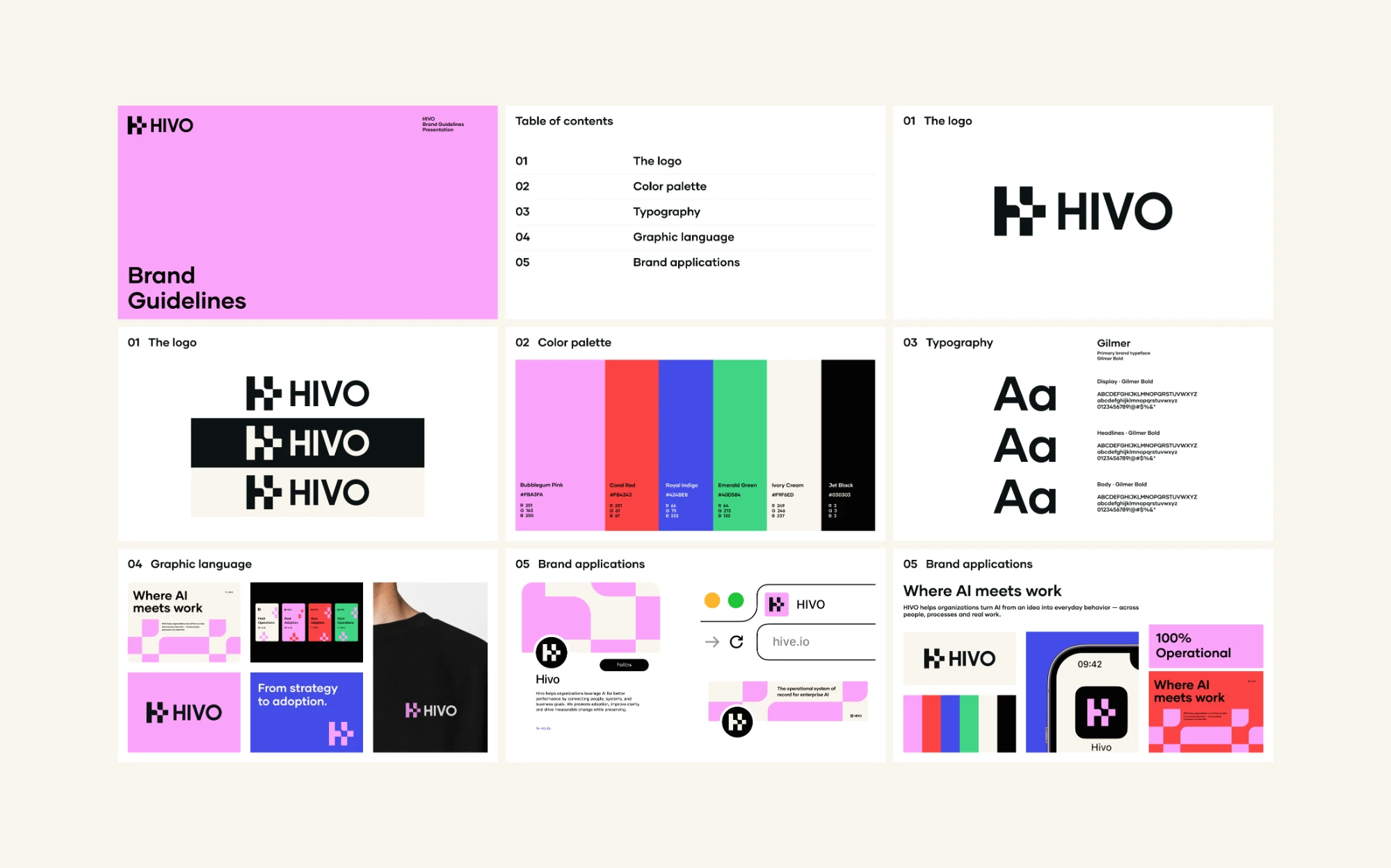
Solvo came to us early, with a strong product and no clear way to explain what it was or who it was for. We worked closely with the founders on the messaging before we touched the design.
The website took its inspiration from a cockpit: control, precision and performance. The more important result is a short message that works the same way in the deck, on the website and on a sales call, and that the whole company can repeat.
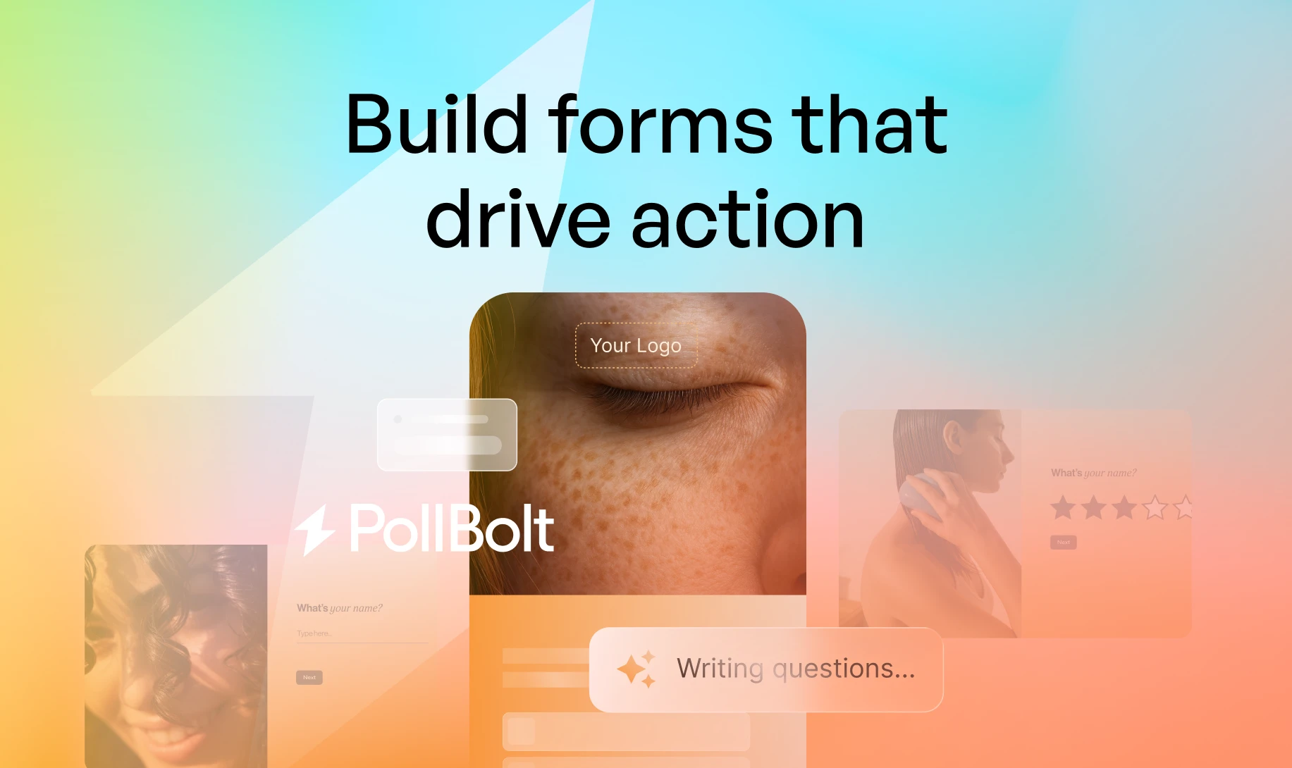
PollBolt works in an especially crowded category: form and survey builders, where every competitor promises beautiful forms that are easy to build. Lead with the same promise and you disappear immediately.
So the brand leads with what happens after the form, not with the form itself: answers become insights, and insights become action. It is a good example of the “instead of what” question. The customer is not only comparing it to another form tool, but also to hours of reading responses and summarizing them by hand.
Name and domain
A startup name has to pass four tests: it is easy to say, it is easy to spell after hearing it once, it sounds different from the competitors, and it leaves the company room to grow.
There are a few families of names, and each has a price:
- Descriptive: says what the product does. Understood immediately, but hard to protect legally and hard to differentiate. It also limits the company on the day the product expands.
- Suggestive: hints at the benefit without describing it. Usually the best balance for a startup, because it is both understandable and distinctive.
- Invented or abstract: unique, easy to register as a trademark and to find a domain for. It takes more investment to fill it with meaning.
- A real word from another world: memorable and warm, but the domain is almost always taken, and it is hard to rank first for a word that already belongs to something else.
What to check before you fall in love with a name
- How it sounds in English. A name built on a guttural “kh”, a “ts” or a rolled “r” sounds completely different in an American customer’s mouth. Ask a few native English speakers to read the name aloud, and to spell it after hearing it.
- Meaning in other languages. A short check in the languages of your target markets saves embarrassment.
- Domain and handles. The .com is free or can be bought, and usernames are available on the networks that matter to you.
- Trademarks. A first search in the United States Patent and Trademark Office database [3] and in WIPO’s Global Brand Database [4]. The full clearance and the registration are a job for an intellectual property lawyer, not for the studio.
- Search results. Search for the name on Google and ask ChatGPT about it too. If a well-known company already has the same name, you will compete with it on every search.
How much the .com matters
Paul Graham, a co-founder of Y Combinator, wrote in 2015 that a US startup that does not own the .com of its name should probably change the name, because a marginal domain signals a marginal company [5]. It is a strict position, and not everyone agrees with it. Today there are successful companies on other extensions and with prefixes such as get or try.
Our recommendation is practical: if the .com is available at a reasonable price, buy it. If not, a good name with a reasonable domain beats a weak name chosen only because its domain was free. And if the name has not been cleared legally yet, do not print it on anything.
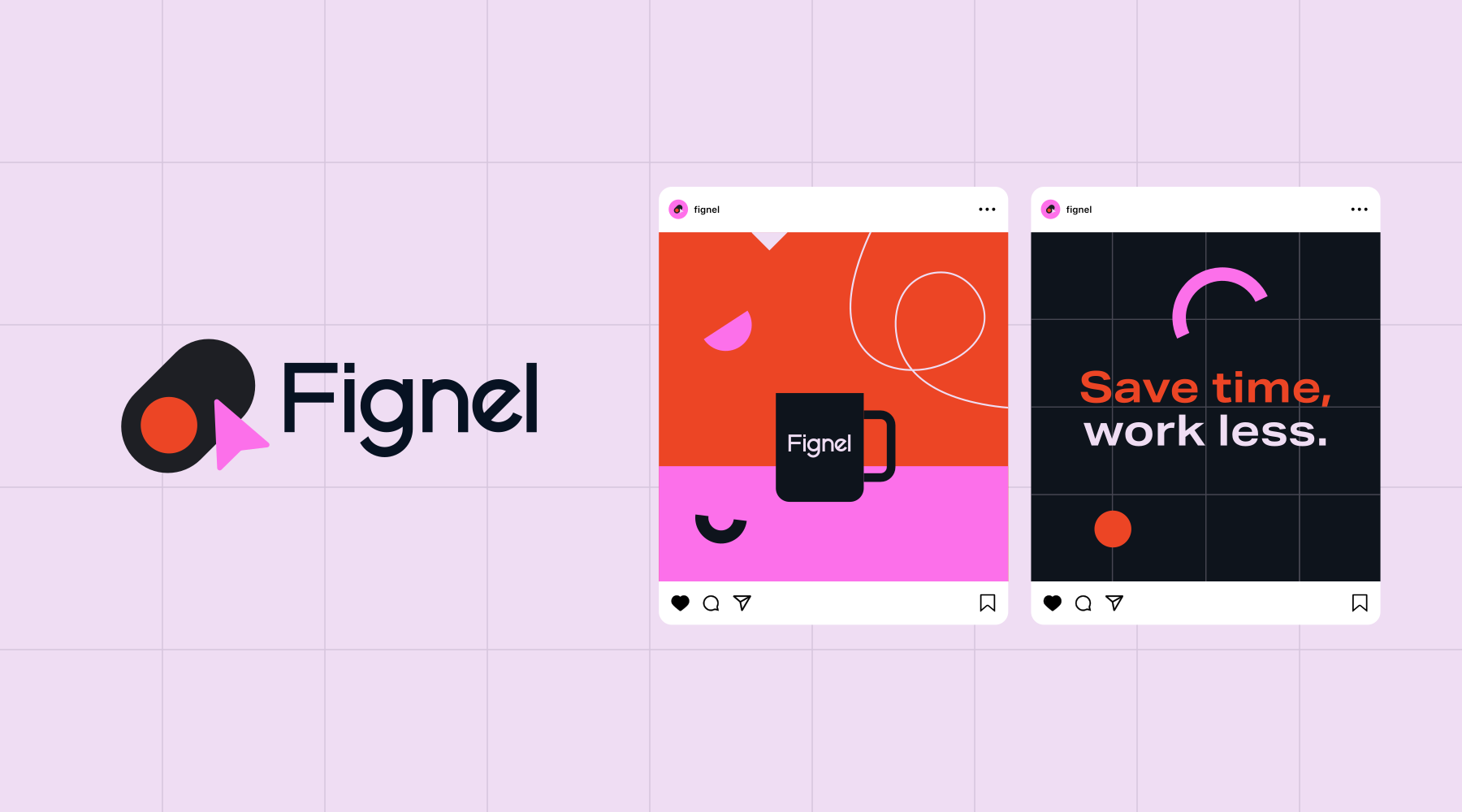
With Fignel we started from the name: one word that explains the promise and speaks directly to the audience, designers who work in Figma. Only after that did we build the identity, the website, the social content and the investor deck.
When the name already carries the promise, everything that comes after it starts from a better place. There is no need to explain what the company does before you can talk about why it is good.
A visual language that holds a product, a website and a deck
A startup’s visual language is a system: a logo, colors, typography, a recognizable graphic element, a style of photography or illustration, and motion. The logo is the small part. What people remember is the overall feeling, and what the team needs is rules it can work with quickly.
Logo
A startup logo is judged first at small sizes: an app icon, a browser tab, a LinkedIn profile picture, the corner of a slide. A logo that only works large is a logo that does not work. Check it on both a dark and a light background, because your product probably supports both.
Color
In many categories all the competitors look the same: blue in cybersecurity, purple in AI, green in fintech. Put the homepages of your ten closest competitors side by side and see which color is still free. One distinctive lead color is worth more than a palette of eight shades.
Typography
The typeface is everywhere: in the interface, on the website, in the deck, on the invoice. Choose one that reads well on a small screen, has enough weights, and has a license that covers use inside an app. If you have an interface or materials in a second script, such as Hebrew, check in advance that the typeface supports both, or that it has a good partner.
Motion and a recognizable element
A digital product moves, and so does its brand. A short logo animation, the transitions in the interface and the way elements enter the screen are all part of the identity. One recurring graphic element, a shape, a character or a pattern, lets people recognize the brand even when the logo is not there.
A short brand book
For a seed-stage startup, a brand book of a few pages is enough, with organized files and ready templates for decks and social content. An eighty-page book nobody opens is worth less than two pages everyone uses.
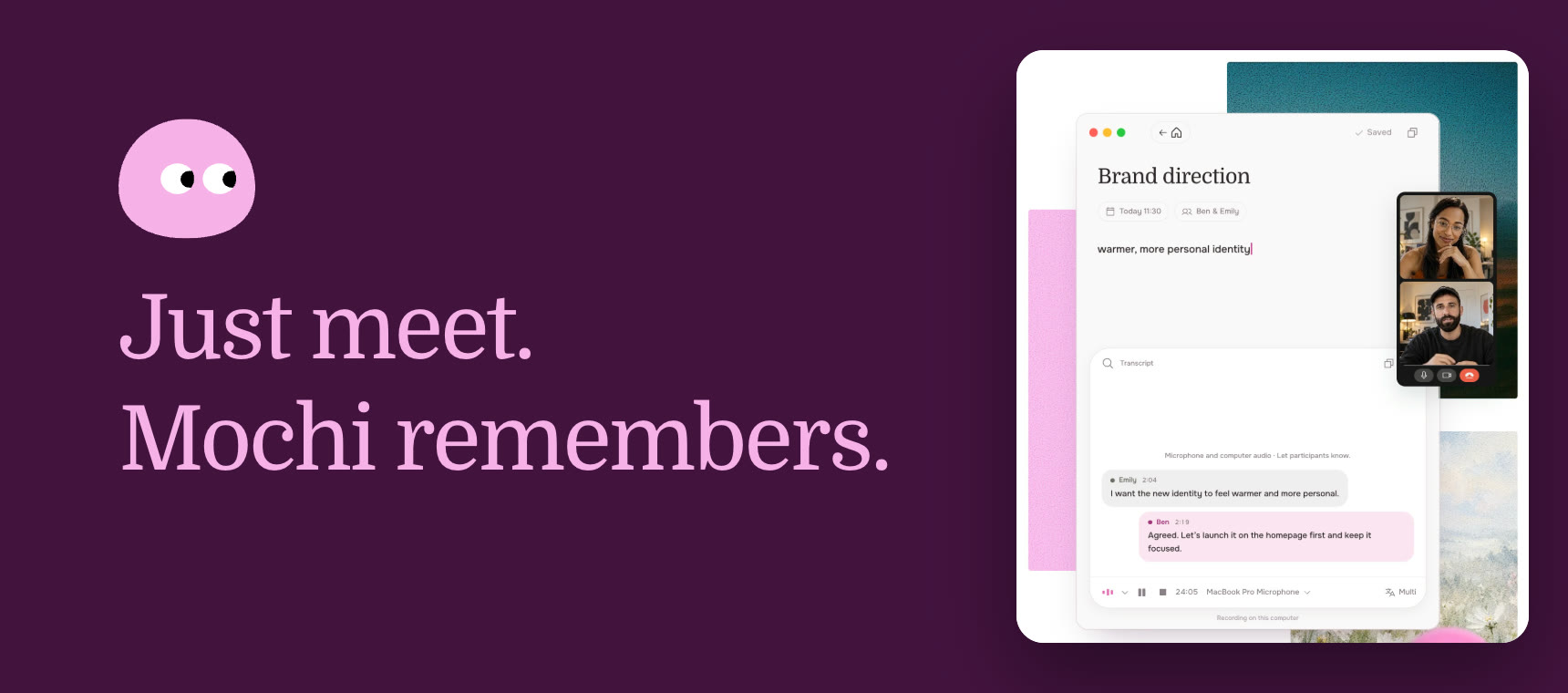
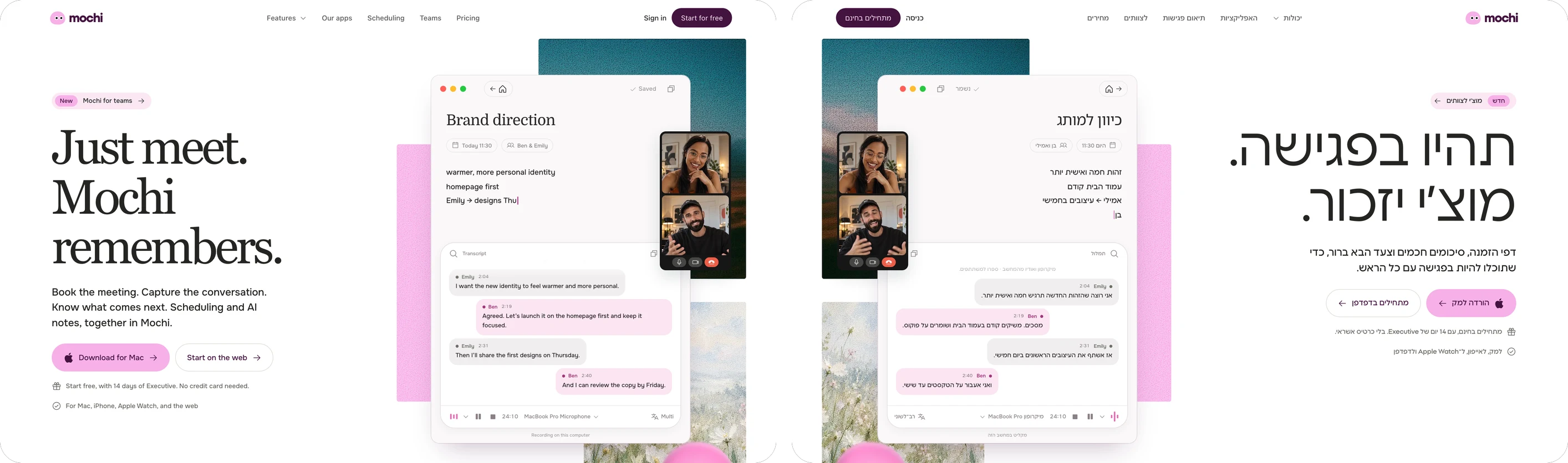
Mochi schedules the meeting, writes the summary and prepares the next step. We built the brand around that promise: a soft mark with two eyes that behaves like someone who is listening. It looks, blinks and follows what is happening.
Pink and deep purple lead, and turquoise and light blue give each part of the product a place of its own. One typeface carries the interface in English and in Hebrew. The same language runs through the website, the web app, the Mac, the iPhone and the Apple Watch, so a meeting feels the same everywhere.
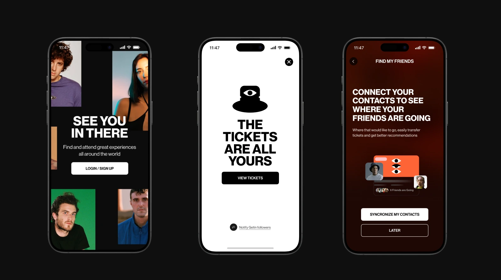
For GETIN we built the brand from scratch: the logo, the eye symbol, the graphic language and the app itself. Red, black and white make the brand direct, and additional colors open it up to different scenes.
We also tested the language outside the app, in poster and campaign mockups, to see that it holds at every size. That is the test of a good system: each use has a character of its own, and it is still obvious that they all belong to the same brand.
The brand inside the product
In a technology startup, the place where customers spend the most time with the brand is the product itself. A website is seen once or twice. The interface is opened every day. A brand that stops at the homepage is half a brand.
Where the brand lives inside the product:
- Interface components. Buttons, cards, forms and tables built from the same colors, typefaces and radii as the website.
- Microcopy. Error messages, empty states, button labels. This is where the brand’s tone is felt more than in any headline.
- The first moments. Sign-up, the welcome email, the first screen. This is the real first impression, after the customer has already been convinced.
- What goes out. Reports, automated emails, share links, invoices. Each of them reaches people who do not know you yet.
When the brand and the product are built separately, you get a website that promises one thing and an interface that feels like another company. When they are built together, the decisions save each other work: the product’s component library is also the website’s component library.
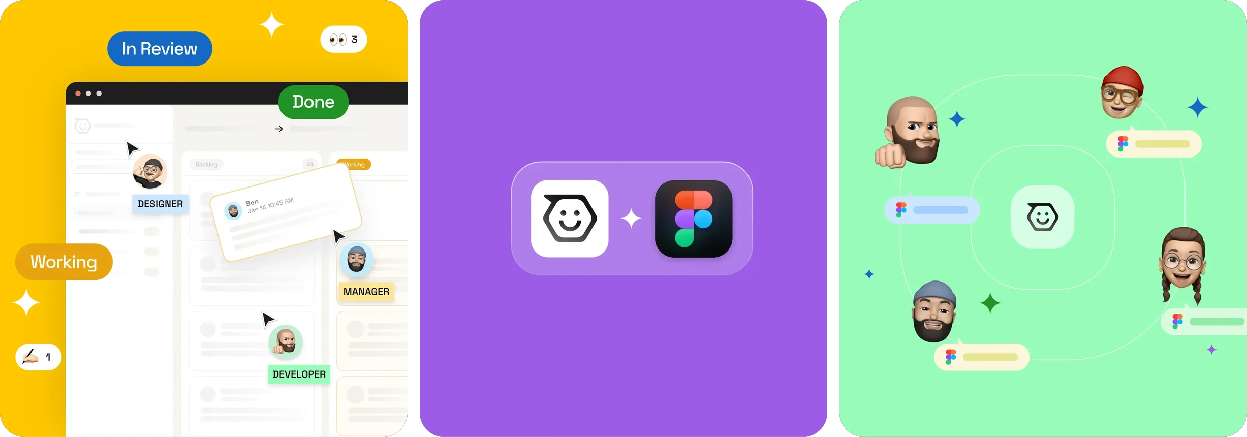
Figcoms takes the comments out of Figma and puts them on an organized board. The first version did too much: every comment became a form. We cut it down to four statuses and emoji, and to one idea: one link, and everything is clear.
The identity, the motion language and the landing page were built alongside the app, so the product and the way it is talked about say the same thing. A team of two, four months of work, and 33rd place on Product Hunt on launch day.
The website: the main brand asset
The website is the only place where all three of a startup’s audiences meet. An investor checks it before a meeting, a customer after a sales call, a candidate before an interview. It has to answer the same first question for all of them: what does this company do, and for whom.
The first impression forms very quickly. A study by Gitte Lindgaard and colleagues found that people form an opinion about the look of a web page after an exposure of just 50 milliseconds, and that the opinion stays similar after a longer look [6]. In practice, the design decides whether the headline gets read, and the headline decides whether people keep scrolling.
What a startup website must have:
- One headline that says what the product does and for whom, without words any competitor could use.
- The product itself, in plain view: real screenshots, a demo or a short video. Not an abstract illustration of a “platform”.
- Proof: customers, numbers, testimonials, investors. Whatever you have, even if it is not much.
- A clear way to continue: a demo, a free trial or a call. One main action, not five.
- A real About page: who the founders are, where they came from and why they are the ones to do this.
- A careers page that explains why to work with you, not just a list of roles.
We wrote about why so many homepages end up interchangeable in why most startup websites sound exactly the same, and about what to fix before a redesign in your website looks expensive but says nothing.
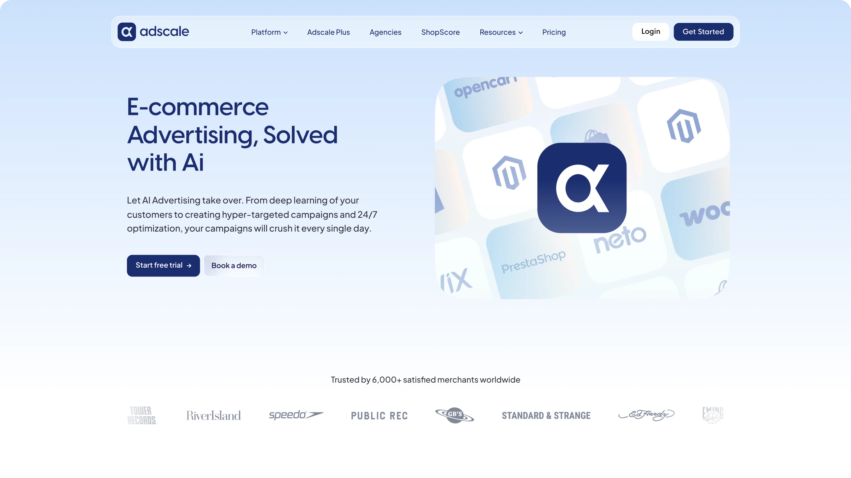
AdScale is a complex platform, and the challenge was to make it feel simple. We designed the website and the landing pages around a direct explanation of the product: clear headlines, the product in the center and calls to action that are hard to miss.
We connected the new brand to every place people meet the company: the website, the landing pages, the product and the internal materials. That way AdScale feels like one product, from creating a campaign to the performance report.
The investor deck and the raise
The investor deck is usually the first branded material a startup produces, and it gets read fast. According to the data DocSend publishes on fundraising decks, an investor gives a deck only a few minutes, and that time has been getting shorter in recent years [7].
So the job of design in a deck is to serve the argument. A headline that states the slide’s conclusion, one large number instead of a table, and a consistent language that lets the reader concentrate on the content. A deck that looks like the website and the product also says something about the team: that it pays attention to detail.
If you are preparing for a raise, this is the work we do in our investor deck service.
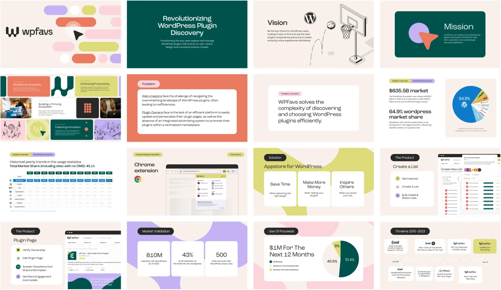
Pretty Damn Quick came to us with a product that was ahead of its brand. We worked closely with the CEO on the interface design, a Webflow website and a new investor deck, so the story for investors and the product would finally look like the same company.
At Fignel the deck was built as part of the same process as the name, the identity and the website, and it went with the company into its fundraising.
What changed in 2026
Three things have changed startup branding in the last few years, and all of them have to do with AI.
1. Decent design became available to everyone
Today any founder can generate a logo, a color palette and a website in a day, and the result will look decent. That is exactly why looking decent no longer sets anyone apart. When everyone uses the same tools, you get the same gradients, the same illustrations and the same headlines.
Differentiation moved to what the tools do not decide for you: what the company stands for, what it chooses not to say, and how it sounds. A brand with a clear point of view stands out more today than it did five years ago, because the background around it has become more uniform.
2. AI engines describe you to customers
Customers, investors and candidates ask ChatGPT, Gemini and Claude which companies are the best in a field, and what the difference is between you and a competitor. The answer is built from what is written about you online: the website, LinkedIn, articles, profiles on review sites, technical documentation.
So consistency, which was always a branding principle, has become a technical matter. If you are a “security platform” on the website, a “permissions management solution” on LinkedIn and a “DevOps tool” in an article, the engine does not know which category to put you in. A company that describes itself with the same sentence everywhere gets a more accurate description.
There is research behind this as well. Researchers from Princeton and other institutions showed that adapting content for generative engines can raise its visibility in answers by up to 40%, and that the effect varies from field to field [8]. We cover the practical side in GEO is not SEO with a new hat and in how to measure what AI says about you.
3. Your next visitor may be an agent
AI agents already read websites, compare products and prepare shortlists for people. An agent is not impressed by animation. It reads text. If your pricing, capabilities and integrations exist only inside an image, a video or a PDF, as far as the agent is concerned they do not exist.
What this means for the brand: the website has to be beautiful for people and clear for machines. Real text that answers questions, pages that explain who the product is right for and who it is not, and facts that can be quoted.
Where AI helps in the branding process, and where it does not
We use AI in our work, and it makes the work shorter. It is good at competitor research, at producing dozens of variations of a name or a headline, at fast mockups and at first drafts. It does not replace the decision. Choosing one direction out of fifty, knowing what is right for this company and this market, and insisting on the details is still work for people.
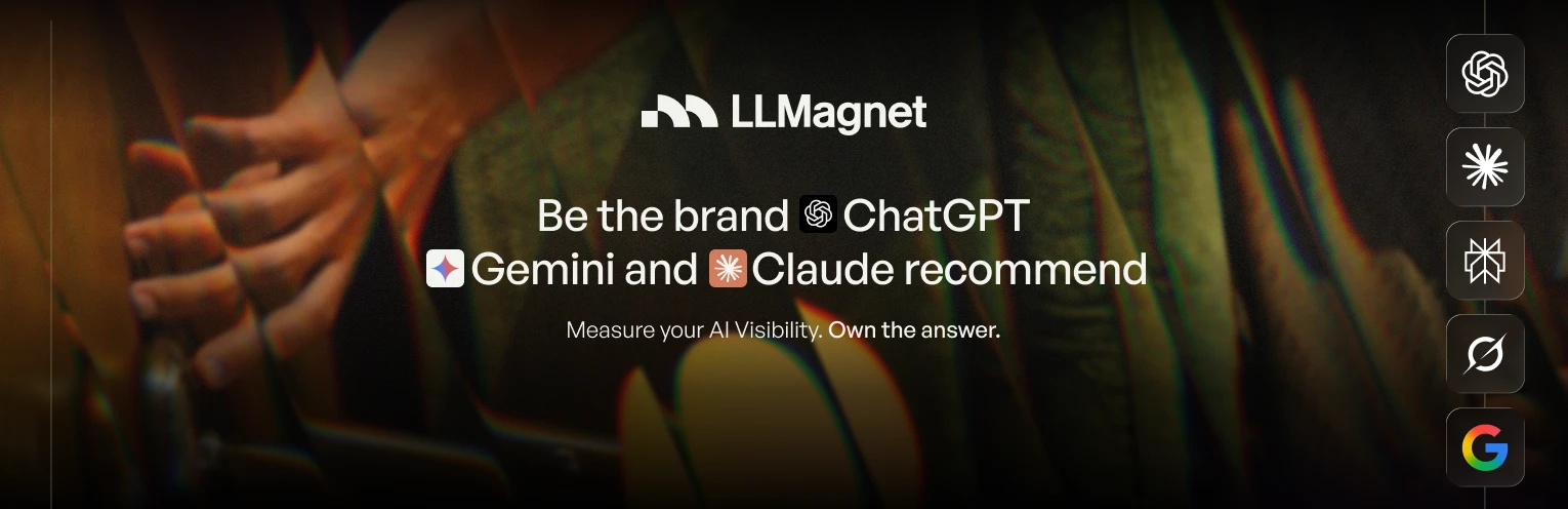
LLMagnet measures how ChatGPT, Gemini and Claude describe a business, and shows what to fix so they recommend it. It is a new category, and most of the products in it look like one more dashboard. We chose a different direction: a warm, human brand. A mark that builds the letter M from a square and two arcs, in the shape of a magnet, a palette of olive greens and amber, and cinematic photography of people instead of charts.
The headline, Be the brand ChatGPT, Gemini and Claude recommend, explains in one sentence what the product does, in the customer’s language rather than the technology’s. It leans on names everyone already knows, not on terms most businesses have not heard yet.
An Israeli startup that sells abroad
An Israeli startup selling to the American or European market needs a brand that was built in English from day one, not a Hebrew brand that was translated. It sounds obvious, and still most of the mistakes we see happen right here.
- Write in English, do not translate. A sentence written in Hebrew and translated sounds translated. Write the messaging in English from the start, and have a native speaker read it before it goes live.
- The tone is different. Israeli directness can read as aggression in English, and enthusiasm can read as exaggeration. An American buyer expects a precise promise and proof, not superlatives.
- The proof has to be local. A well-known Israeli customer does not mean much to a buyer in Texas. One logo of a customer from their market is worth more than ten from yours.
- Do not hide that you are from Israel, and do not build on it either. In fields such as cybersecurity, Israeli origins are an advantage worth mentioning on the About page. They are not the brand’s promise.
- Hebrew still matters for hiring. Your candidates are in Israel. A careers page, LinkedIn and content in Hebrew work alongside a brand that is entirely in English, if you plan for it in advance and choose typefaces that support both languages.
- Currency, dates and address. Small details such as a price in dollars, the American date format and a US address, if you have one, affect the feeling that the company is close to the customer.
Who does the work: yourself, a freelancer or a studio
There is no single right answer. It depends on the stage, on the money and on how much of the work the founders can and want to do themselves.
| Yourself, with AI tools and templates | A freelancer | A studio | |
|---|---|---|---|
| Right for | Pre-seed, before there is money or customers | Pre-seed and early seed, when the scope is well defined | Seed and later, or when the brand is a central part of the product |
| The advantage | Fast and cheap, and the founders know the company best | A professional hand at an accessible price, and a direct relationship | Strategy, design, website and deck from one place, with a structured process |
| The price | You look like everyone else, and nobody challenges the decisions | Usually one person with one specialty, and not always available for the next stage | A larger investment, and it takes time from the founders |
| What to check | That the positioning is written down before you open a design tool | That they have worked with startups, and that you receive organized files | That you see similar work at a similar stage, and who actually does the work |
How long it takes
The length of the work depends mainly on two things: the scope, and how quickly the founders make decisions. The positioning and the messaging are the foundation, the identity is built on them, and the website and the deck are built on the identity. What delays projects is almost never the design. It is waiting for an answer, or a change of direction after production has already started.
Our recommendation is to plan backwards from a real date, such as the start of a round, a launch or a conference, and to leave room for one serious round of revisions.
When to rebrand
A rebrand is right when the company has changed and the brand has not. It is not right when you are simply tired of the logo. Five signs that it is time:
- The product has expanded, and the name or the lead sentence describes only part of it.
- The target audience has changed, for example a move from small companies to large organizations, and the brand still speaks to the previous one.
- Salespeople are building their own materials because the existing ones do not help them sell.
- The company gets confused with a competitor that looks or sounds similar.
- A merger, an acquisition or an entry into a new market where the existing name is a problem.
Not every change calls for a full rebrand. Often a refresh is enough: sharpen the messaging, update the palette and the typography, and put the system in order, without touching the name or the logo. A full rebrand, including a new name, is for cases where the name itself is stopping the company from growing.
Either way, do not change a brand in the middle of a round or a week before a launch. Do it when there is time to update every touchpoint at once, and plan the move for search as well: redirects from the old addresses, updated profiles and a proper announcement to customers.
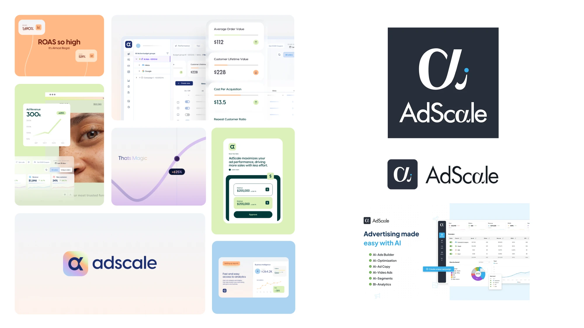
The AdScale rebrand did not stop at the logo. A deep blue logo, soft gradients and a light palette gave the company a recognizable look, and product cards, campaign images and charts brought that language into the platform’s story.
After that we kept working with the team on an ongoing basis: interface improvements, studio work and brand applications inside the company. A successful rebrand is measured in the months after launch, when you see whether the team really keeps working with the new language.
Seven common mistakes
- Starting with the logo. Designing before deciding what the company promises, and then trying to attach meaning to a shape that has already been chosen.
- Copying the category leader. The same color, the same page structure, the same words. The result is a cheaper version of a brand that already exists.
- Talking about the technology instead of the outcome. The customer is not buying an architecture. They are buying less work, less risk or more revenue.
- Investing too much, too early. An eighty-page brand book for a company of three people, a year before the product has settled.
- Investing nothing, too late. A company of fifty people still working with the logo the founder designed one night, where every deck looks different.
- One brand on the website and another in the product. Two teams, two languages, and a customer who feels they moved to another company the moment they signed up.
- Describing the company differently everywhere. The website, LinkedIn and the deck carry three different wordings, and neither people nor AI engines can place you in one category.
A checklist before you go live
- There is one sentence that explains what the company does and for whom, and it passes the swap test.
- There are three supporting messages, each with a proof.
- The name has been checked for how it sounds in English, for its domain, for social handles and in a first trademark search.
- A lawyer has cleared the name before anything is printed or registered.
- The logo reads as a small icon, on a dark background and on a light one.
- The lead color is different from that of the main competitors.
- The typeface supports every language you need, and the license covers the website and the product.
- There is a brand page or a short brand book, and organized files the whole team knows where to find.
- The website, the deck and the product use the same colors, typefaces and components.
- The headline on the website says what the product does, and the product itself is visible on the first page.
- The company description is identical on the website, on LinkedIn, in the deck and on outside profiles.
- The important information on the website is written as text, not only inside images or a PDF.
If you are heading into a raise, a launch or a change of direction, and want a brand, a website and a deck that sit on the same decision, you can read about our branding services, about investor decks, or talk to us.
Frequently asked questions
What does startup branding include?
Startup branding includes positioning, a name and domain, a lead sentence and messaging, a logo and visual language, a short brand book, a website, an investor deck and a language for the product interface. The scope changes with the stage: at pre-seed the basics and a deck are enough, and at Series A you need a full system a whole team can work with.
When should a startup start branding?
Define the positioning from day one, because it affects the product, the deck and every conversation with an investor. Invest in an organized visual identity from the moment the company starts meeting investors, customers and candidates, and expand it after the seed round.
How much does startup branding cost?
The price depends on the scope, not the stage: whether the work includes strategy and naming, how many materials are produced, and whether the website and the deck are part of the project. A pre-seed startup can manage with a limited foundation, and after the seed it makes sense to invest in a full process.
How long does startup branding take?
It depends on the scope and on how quickly the founders make decisions. The positioning and the messaging come first, the visual identity is built on them, and the website and the deck are built on the identity. Plan backwards from a real date, such as the start of a round or a launch, and leave room for a round of revisions.
Can you brand a startup with AI?
You can use AI to shorten the process: competitor research, name ideas, messaging drafts and fast mockups. What it does not do is decide. Choosing one direction, fitting it to the market and the audience and getting the details right remain work for people, and without them the result looks like every other company that used the same tool.
What is the difference between branding and positioning?
Positioning is the decision: who the product is for, instead of what and why this one. Branding is everything that turns that decision into something people can see, read and remember, meaning the name, the messaging, the design, the website and the product. Positioning without branding stays in a document, and branding without positioning is design without a reason.
Should an Israeli startup brand itself in English?
If the customers are abroad, yes. Build the name, the messaging and the website in English from the start instead of translating from Hebrew. Hebrew stays useful for hiring in Israel, so it is worth choosing typefaces and a structure that support both languages.
When does a startup need a rebrand?
When the company has changed and the brand has not: the product has expanded, the target audience has changed, salespeople have stopped using the existing materials, or the name is a problem in a new market. Often a refresh of the messaging and the visual language is enough, without changing the name or the logo.
What matters more for a startup, the brand or the product?
The product. A good brand will not save a product that does not solve a problem. But a good product that nobody understands, or that looks less serious than it is, loses the investors, customers and candidates who never got as far as trying it. The brand is what brings people to the product.
Sources
- Bresciani, S. & Eppler, M. J. (2010). Brand new ventures? Insights on start-ups' branding practices. Journal of Product & Brand Management, 19(5), 356-366.
- Dawes, J., Ehrenberg-Bass Institute, with the LinkedIn B2B Institute. The 95:5 rule.
- United States Patent and Trademark Office. Trademark Search.
- World Intellectual Property Organization. Global Brand Database.
- Graham, P. (2015). Change Your Name.
- Lindgaard, G., Fernandes, G., Dudek, C. & Brown, J. (2006). Attention web designers: You have 50 milliseconds to make a good first impression! Behaviour & Information Technology, 25(2), 115-126.
- DocSend. The Startup Fundraising Playbook, data on viewing time for fundraising decks.
- Aggarwal, P. et al. (2024). GEO: Generative Engine Optimization. KDD 2024.