Keep scrolling for the
next case study.
Mochi case study
A brand, a website and a product for the AI that books the meeting and takes the notes.
← All work(01)Project
Overview
A meeting tool with a face.
Mochi books the meeting, takes the notes and has the next step ready, so people can stay in the conversation. We built the brand around that promise and carried it all the way through: the logo, the colors, the type and the graphic language, then the website and the product on every screen it lives on.
(Details)
- ClientMochi
- IndustryAI meeting notes and scheduling
- BrandLogo, color, typography and graphic language
- DigitalWebsite, UI and UX
- ProductWeb app, Mac, iPhone and Apple Watch
(02)Brand
Identity
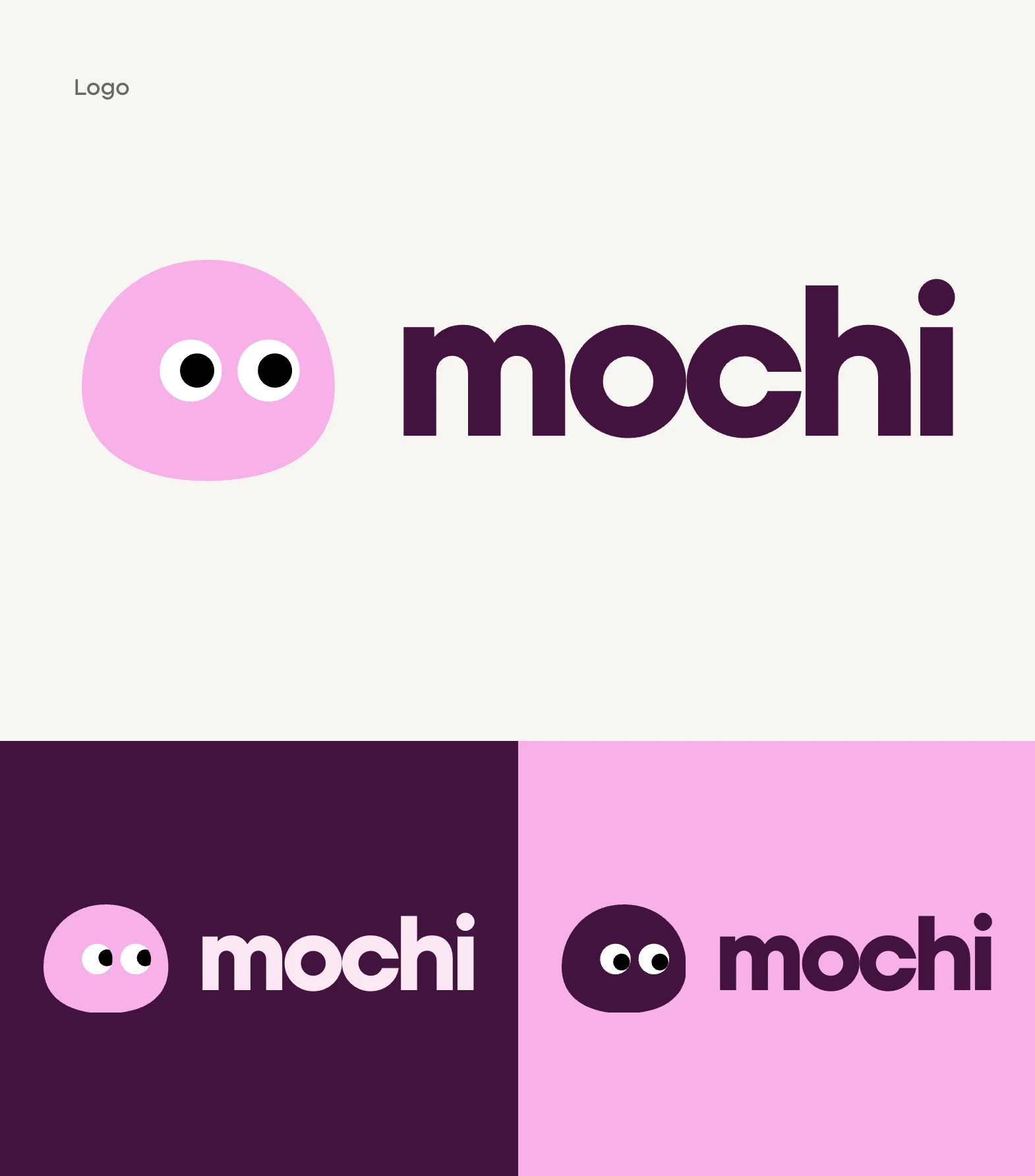
Two eyes that are always paying attention.
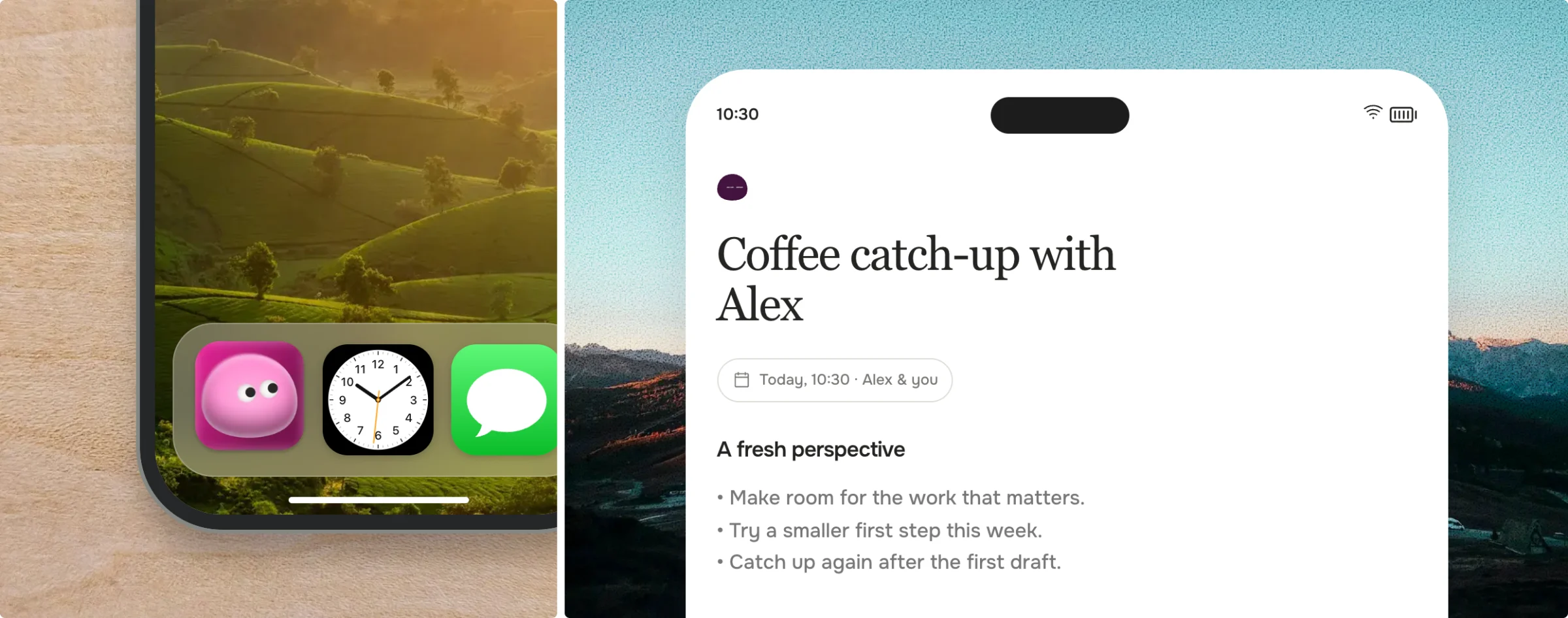
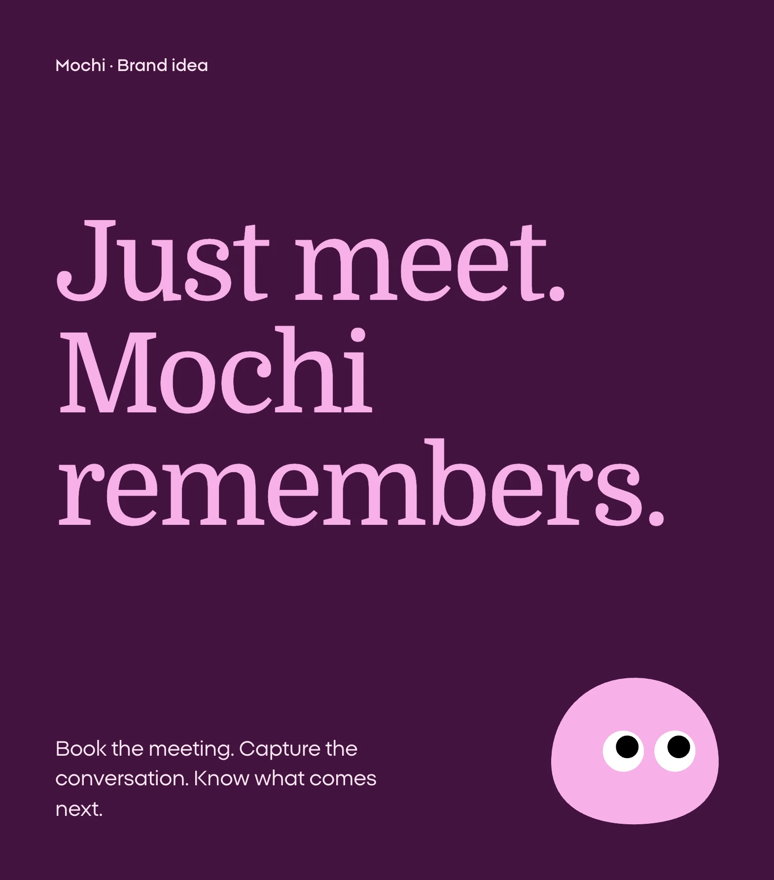
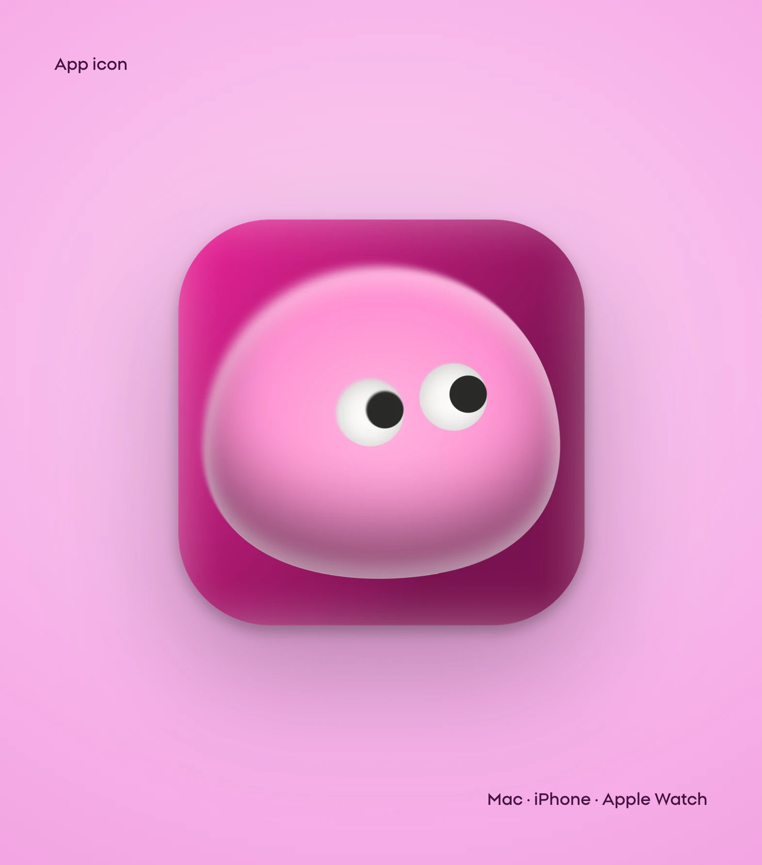
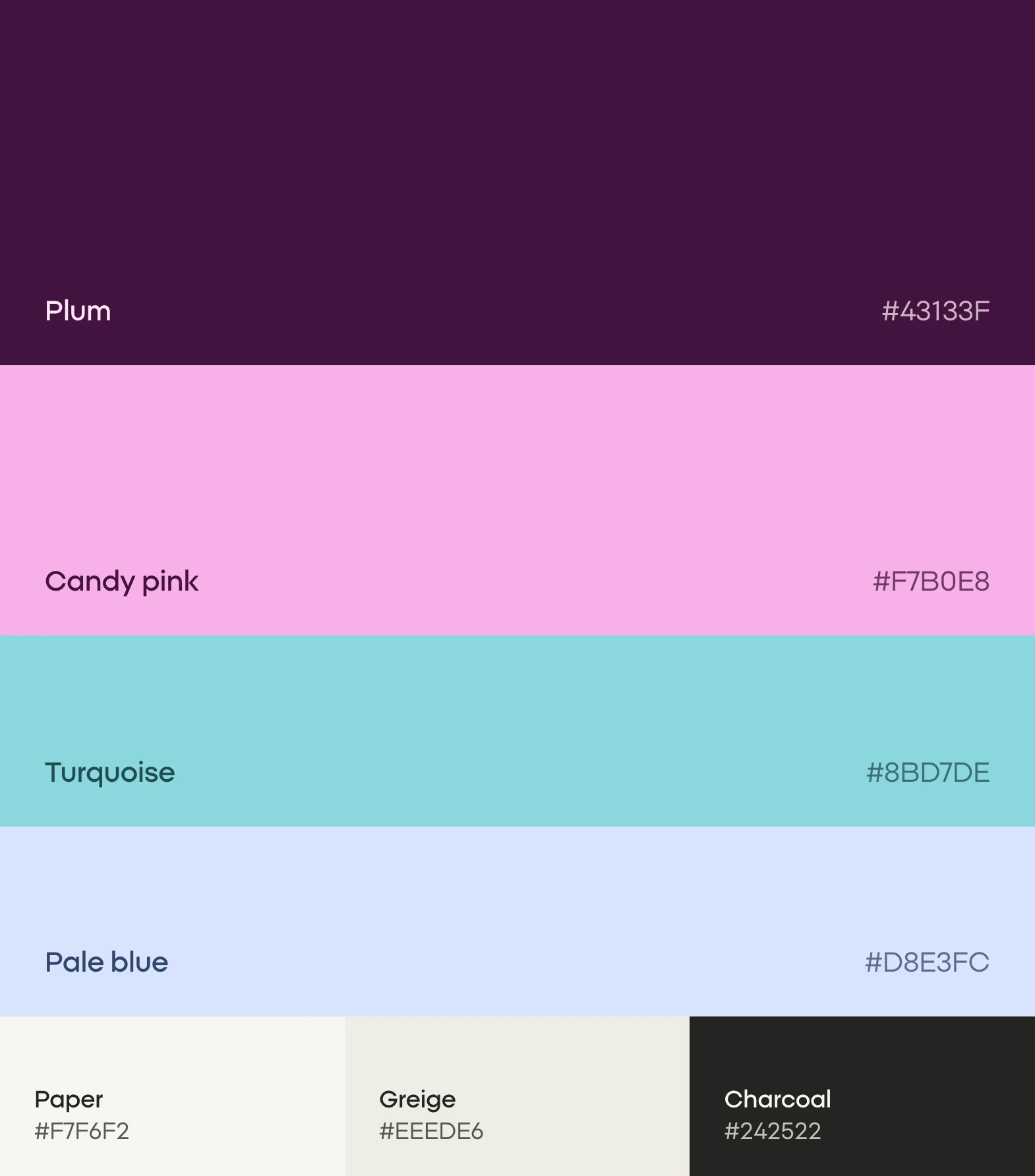
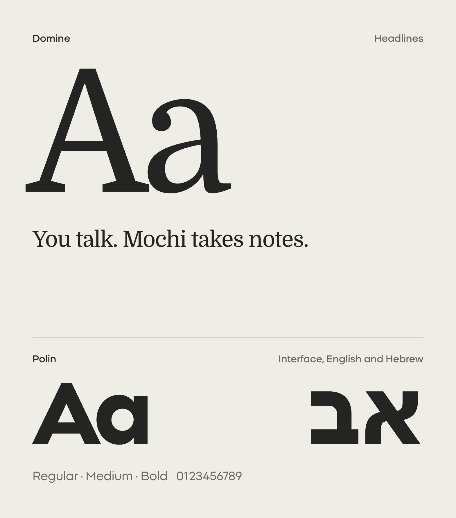
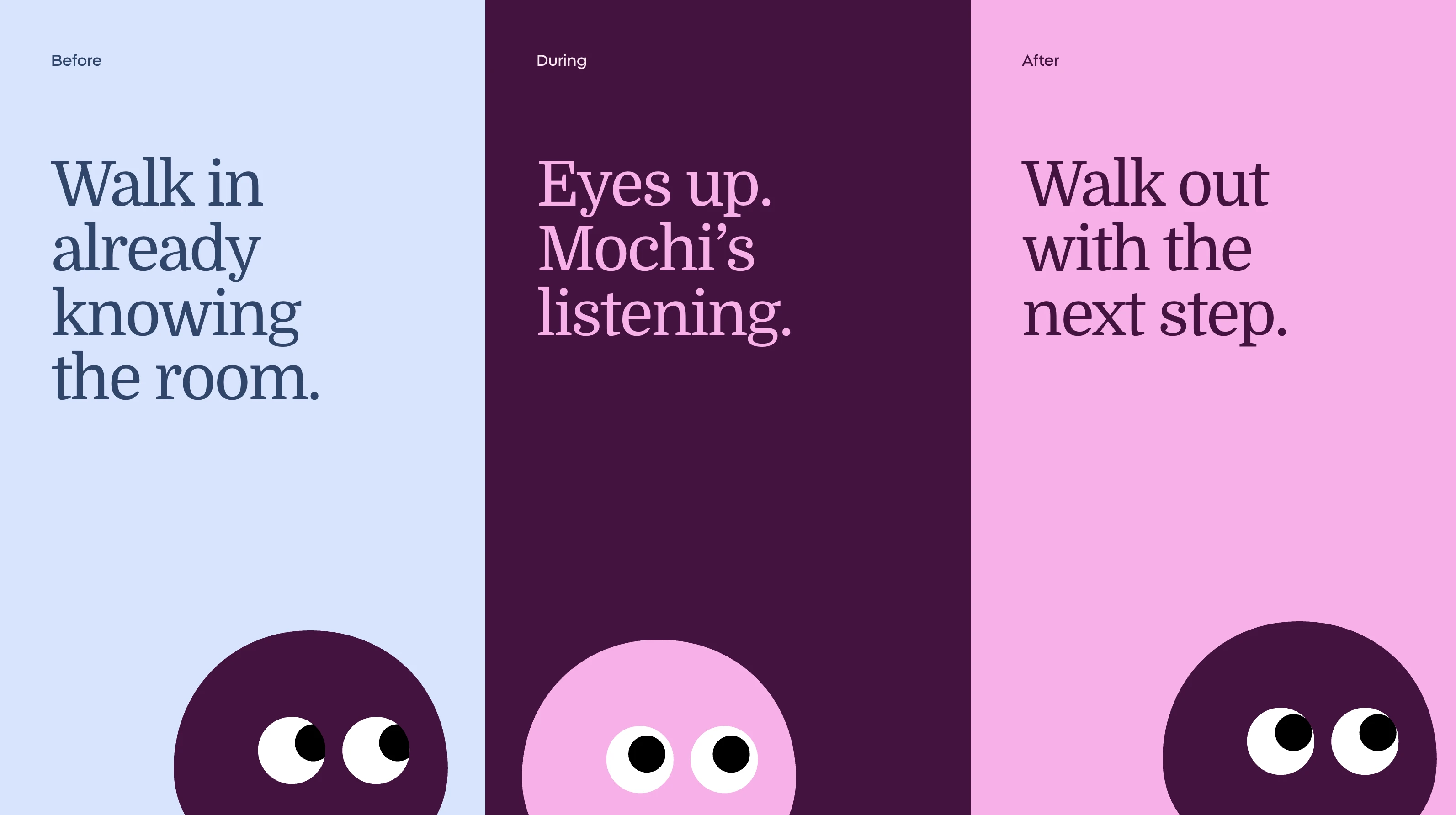
The mark is a soft shape with two eyes, and it behaves like someone listening: it looks around, blinks and follows what is happening. Candy pink and deep plum lead, turquoise and pale blue give each part of the product its own room, and warm neutrals keep it calm. Domine sets the headlines in an unhurried, editorial voice, while Polin carries the interface in English and Hebrew.
(03)Website
Let the product do the explaining.
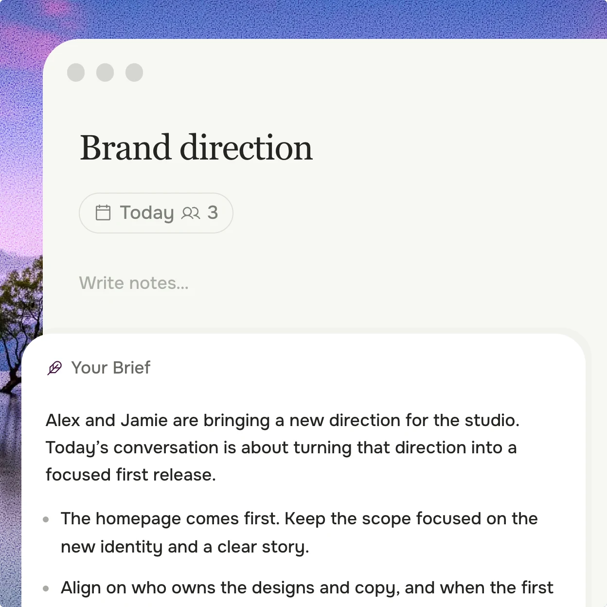
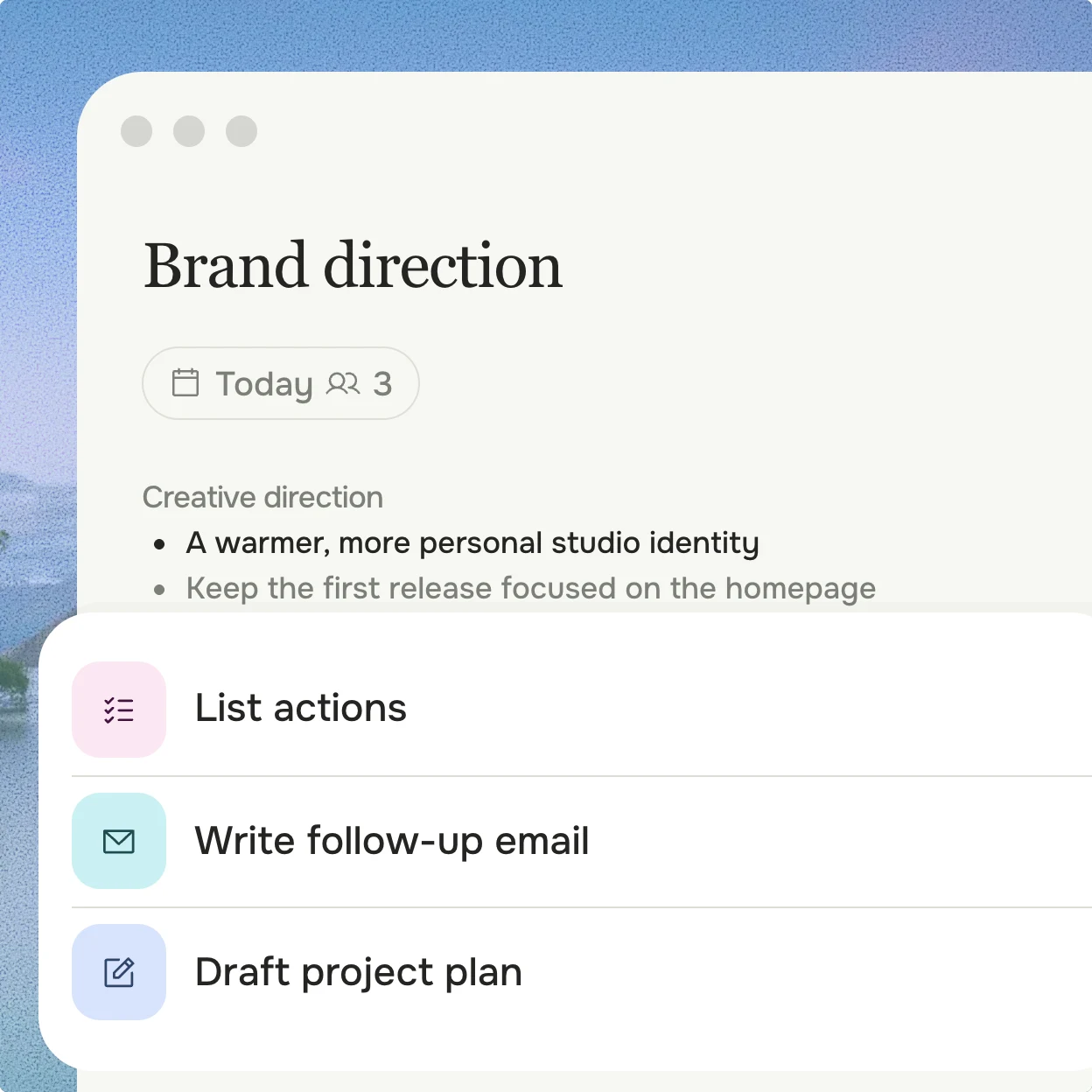
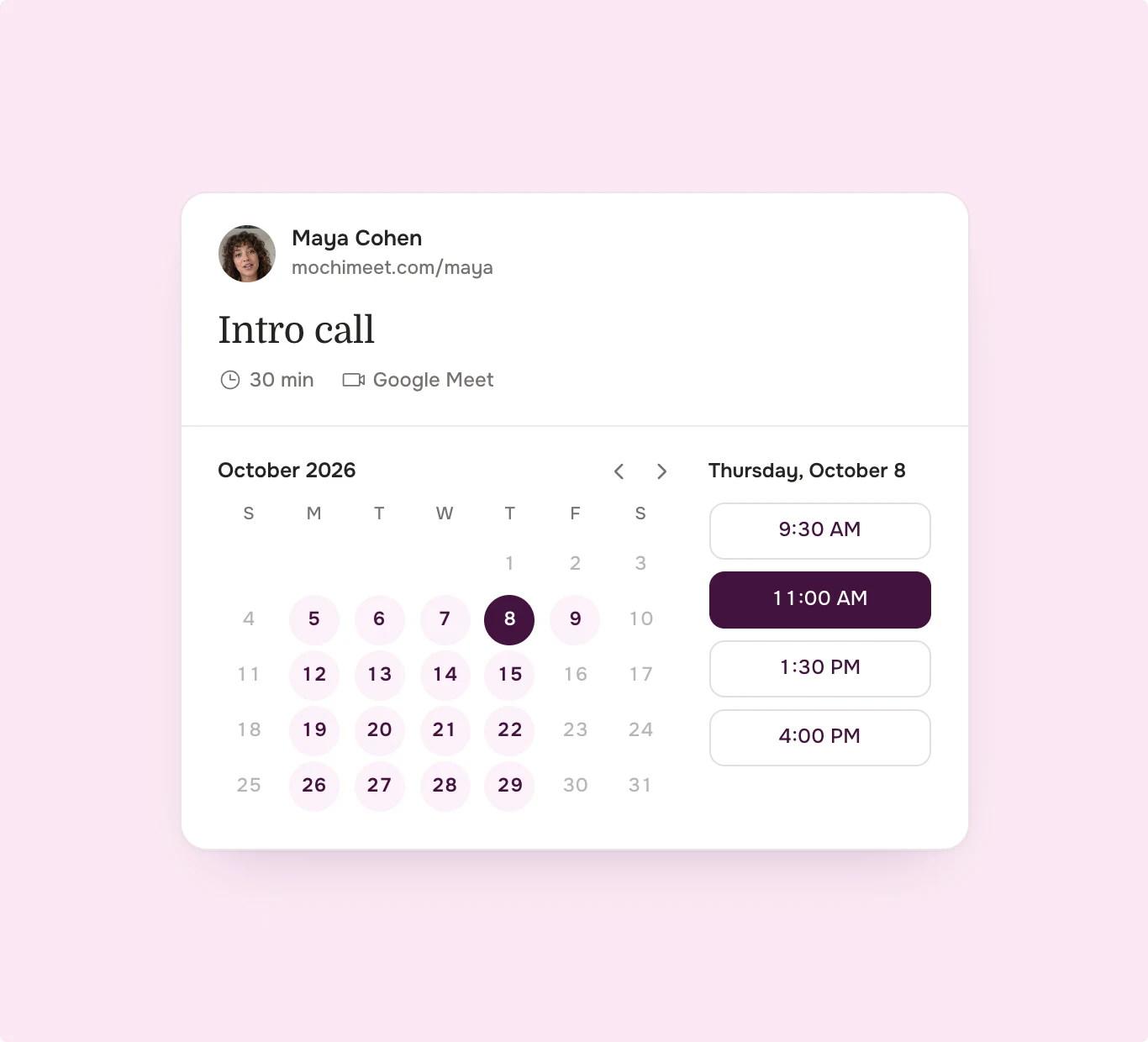
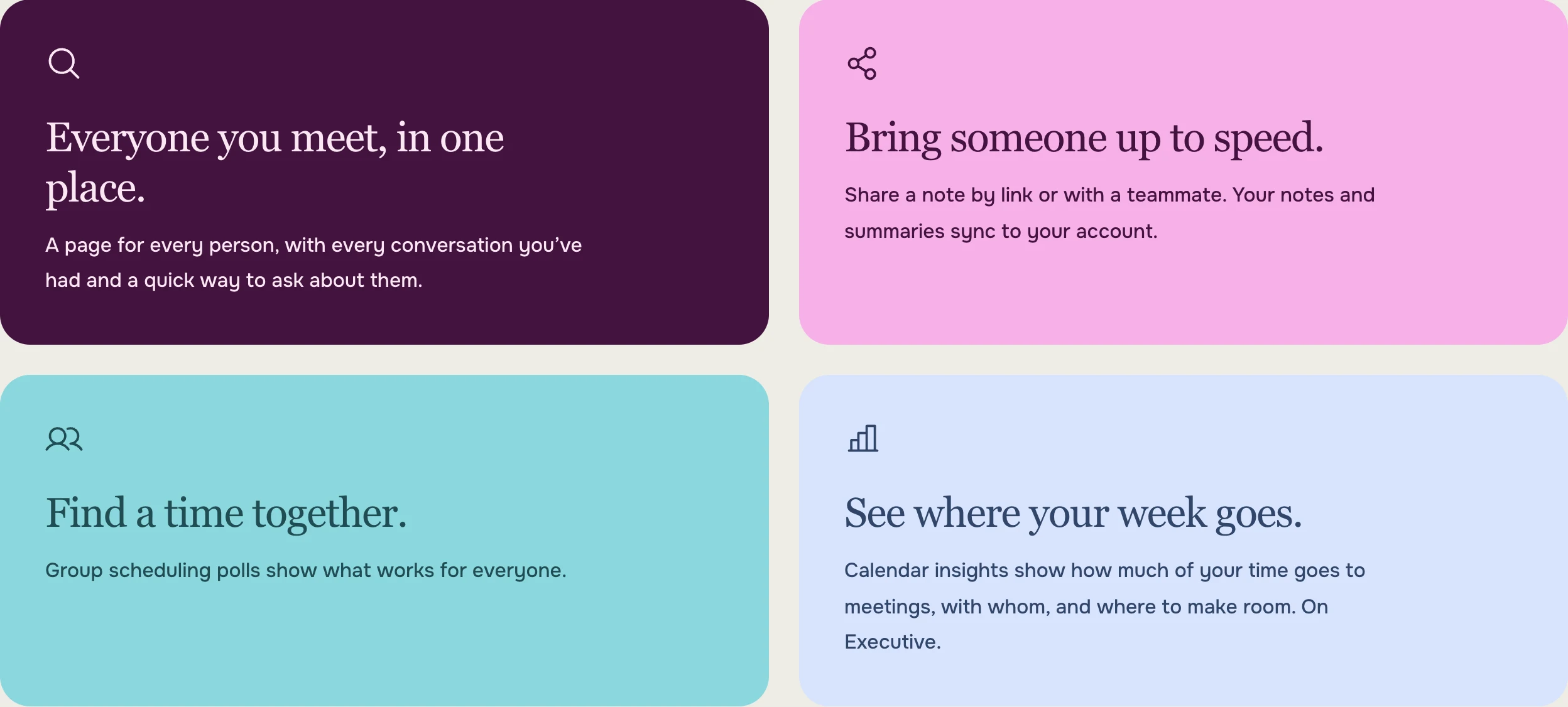
The site shows Mochi at work instead of describing it. Product windows type their own notes, write the brief and book the meeting, set on desktop wallpapers so every scene feels like a real screen. Blocks of brand color mark the chapters, from scheduling to the agent, and the whole site runs in English and in Hebrew, mirrored right to left.
(04)Product
& Apps
One Mochi, on every screen.
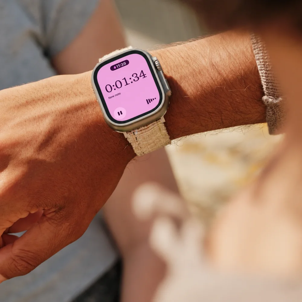
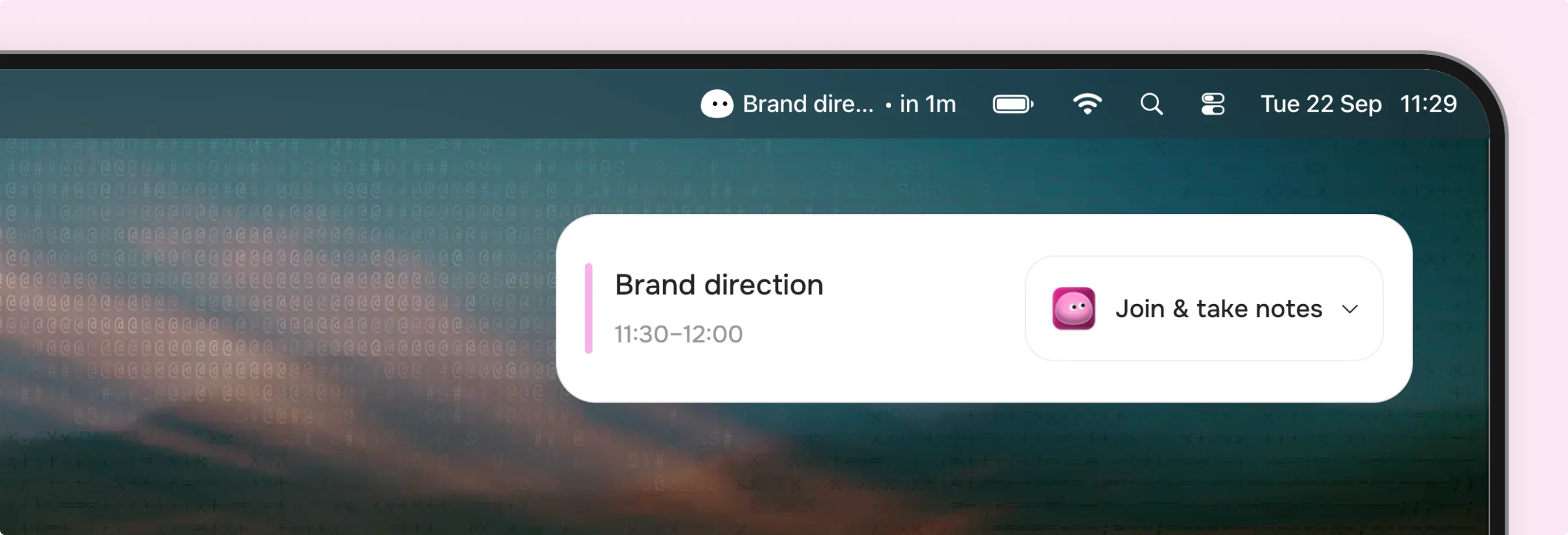
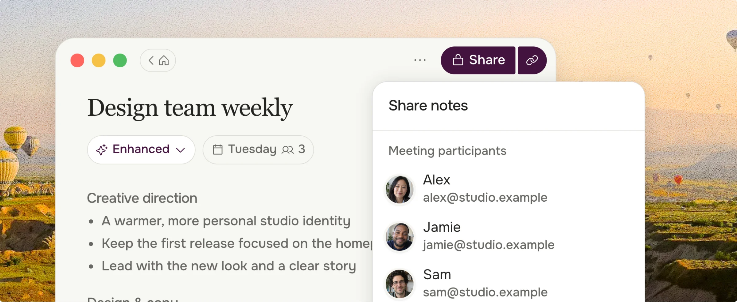
The same language runs through the web app, the Mac app, iPhone and Apple Watch. Notes, briefs, booking pages and sharing are built from one set of components, so a meeting feels the same wherever it happens. The mark turns up where it is useful: in the menu bar before a call, on the wrist while recording, and next to the summary afterwards.