Keep scrolling for the
next case study.
Figcoms case study
A workflow platform that turns scattered Figma comments into a structured, syncable board.
← All work(01)Project
Overview
Figma comments are powerful. The work around them is broken.
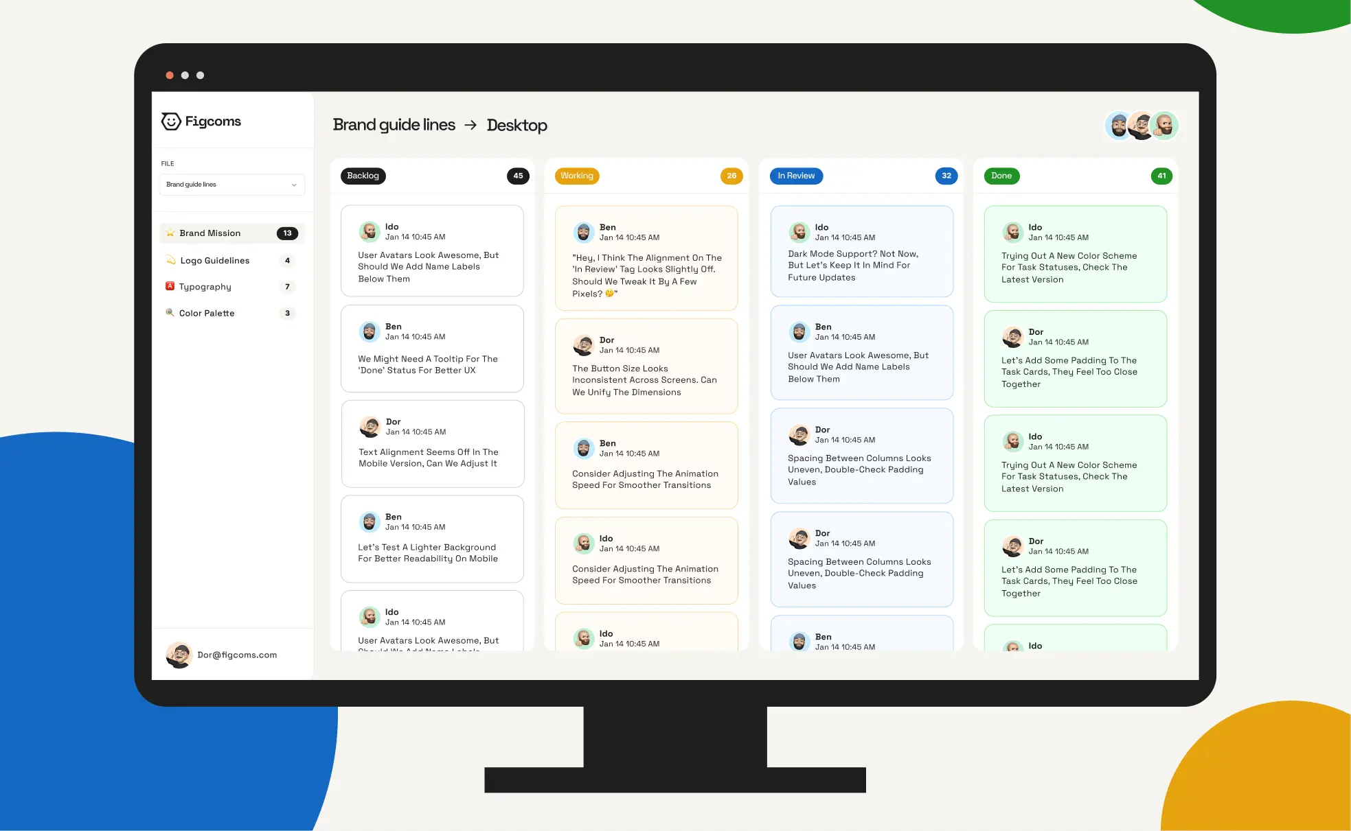
Figcoms is built on a simple idea. Instead of pulling teams out of Figma, it extends it, turning scattered comments into a structured, syncable workflow that lives where the work already happens. We co-founded Figcoms and designed the product: the board, the four states and the flow between them. The identity, the motion language and the landing page were built in parallel with the app.
(Details)
- ClientFigcoms (co-founded by Spank)
- IndustryDesign collaboration software
- ProductProduct design, UX and UI
- BrandIdentity and art direction
- MotionMotion language and 3D
- DigitalLanding page and launch emails
- TimelineFour months, 2025
(02)Why it
exists
Past ten frames, nobody can tell what is done.
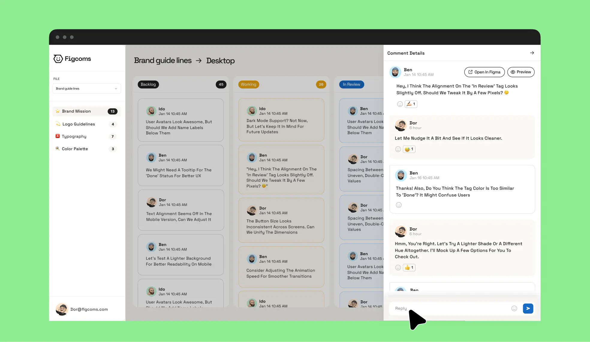
Design and dev teams at companies like Elementor and Salesforce comment inside Figma all day. Once a file grows past ten frames, nobody can tell what is waiting, what is being worked on, what is in review and what is done. The first version did too much. Its controls turned every comment into a form. We cut them down to four states and an emoji, once they started adding complexity instead of removing it.
(03)Process
Paste a Figma link. Get an organized workspace.
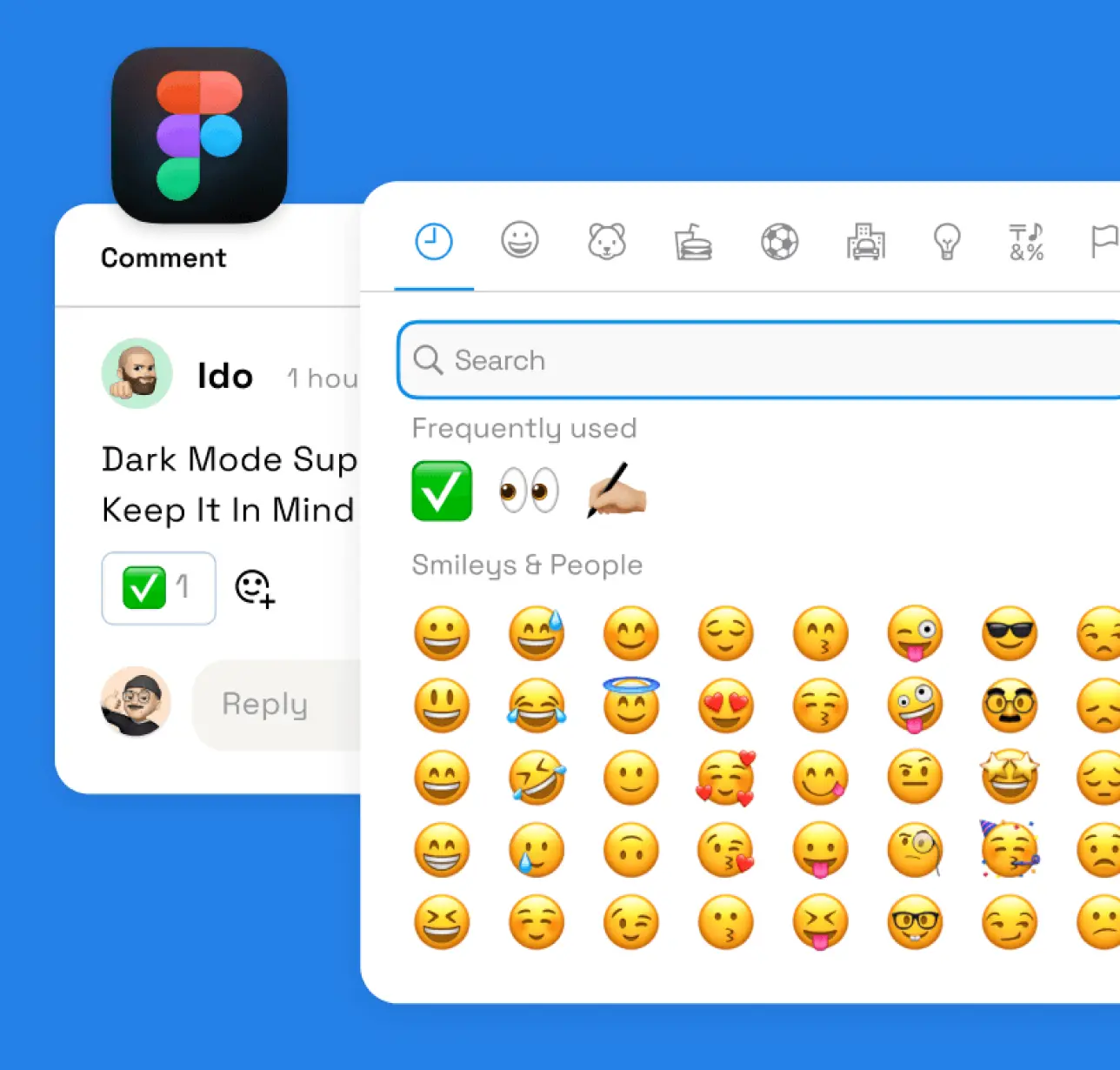
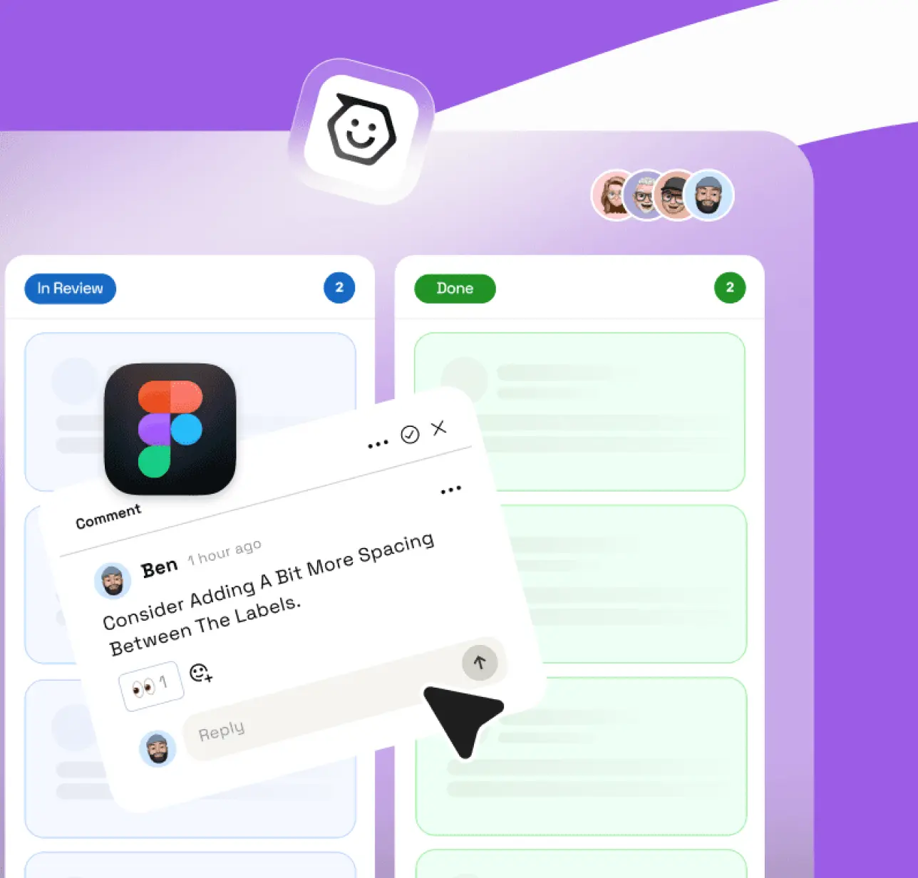
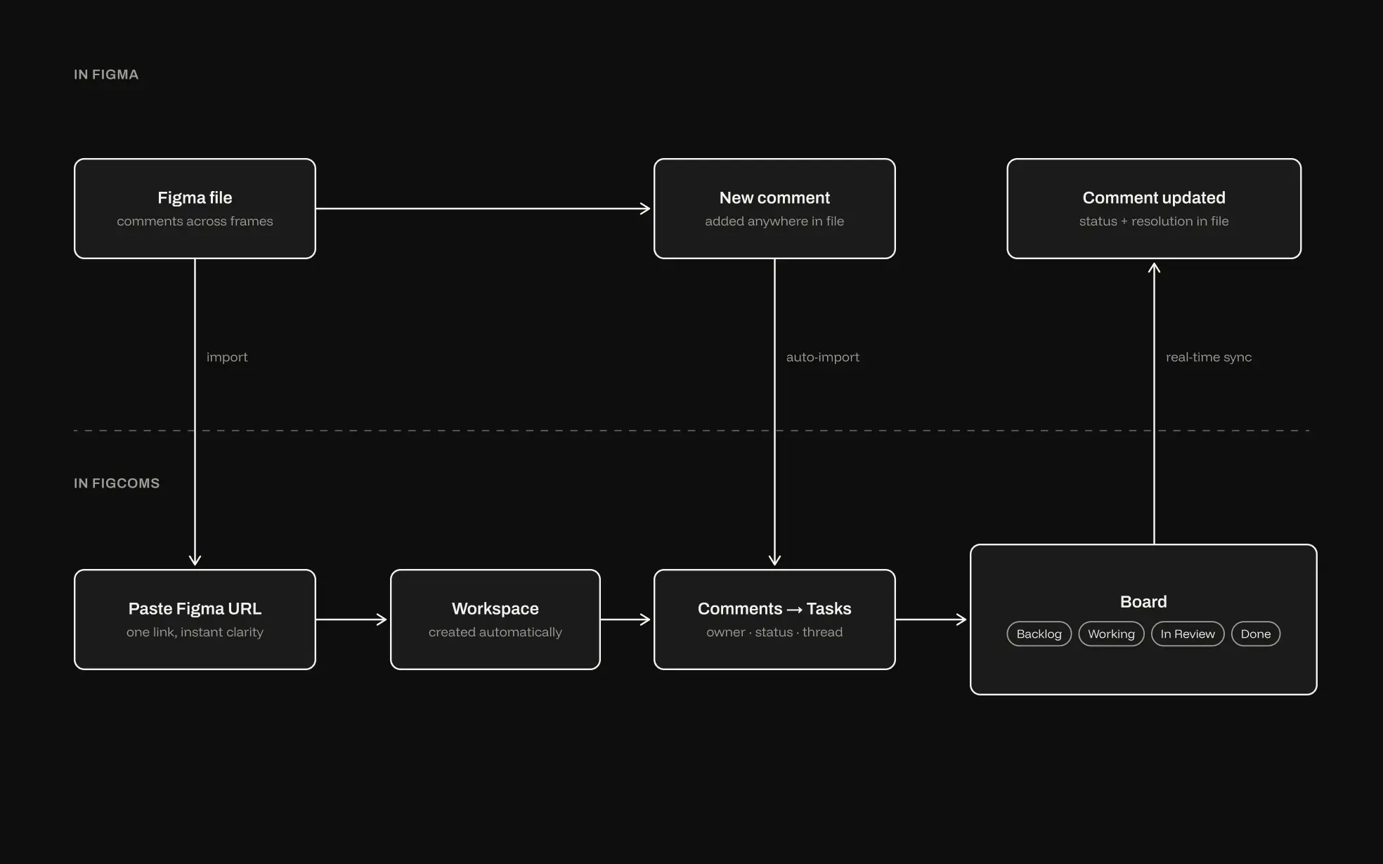
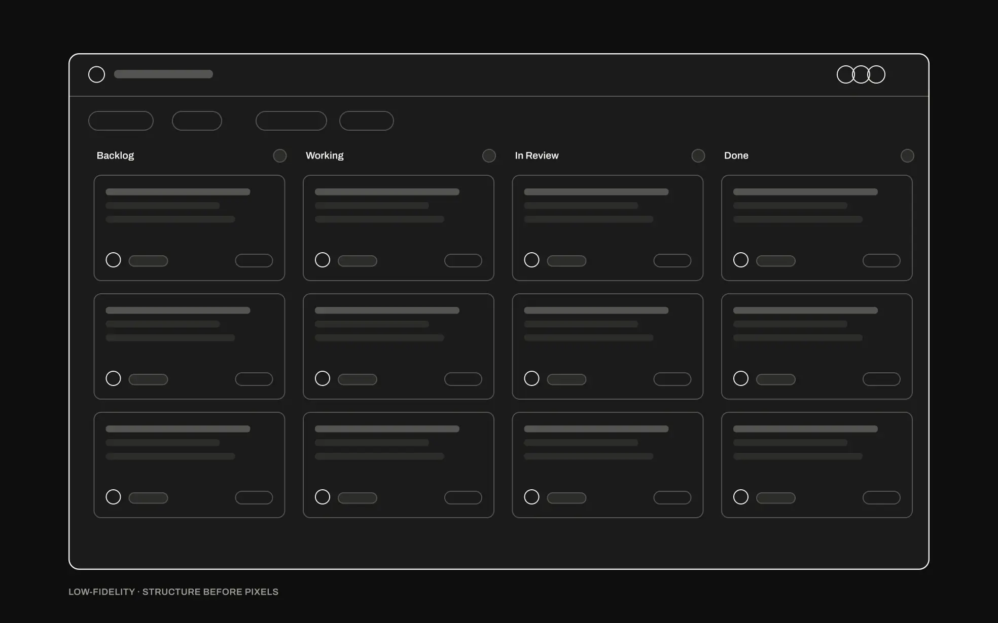
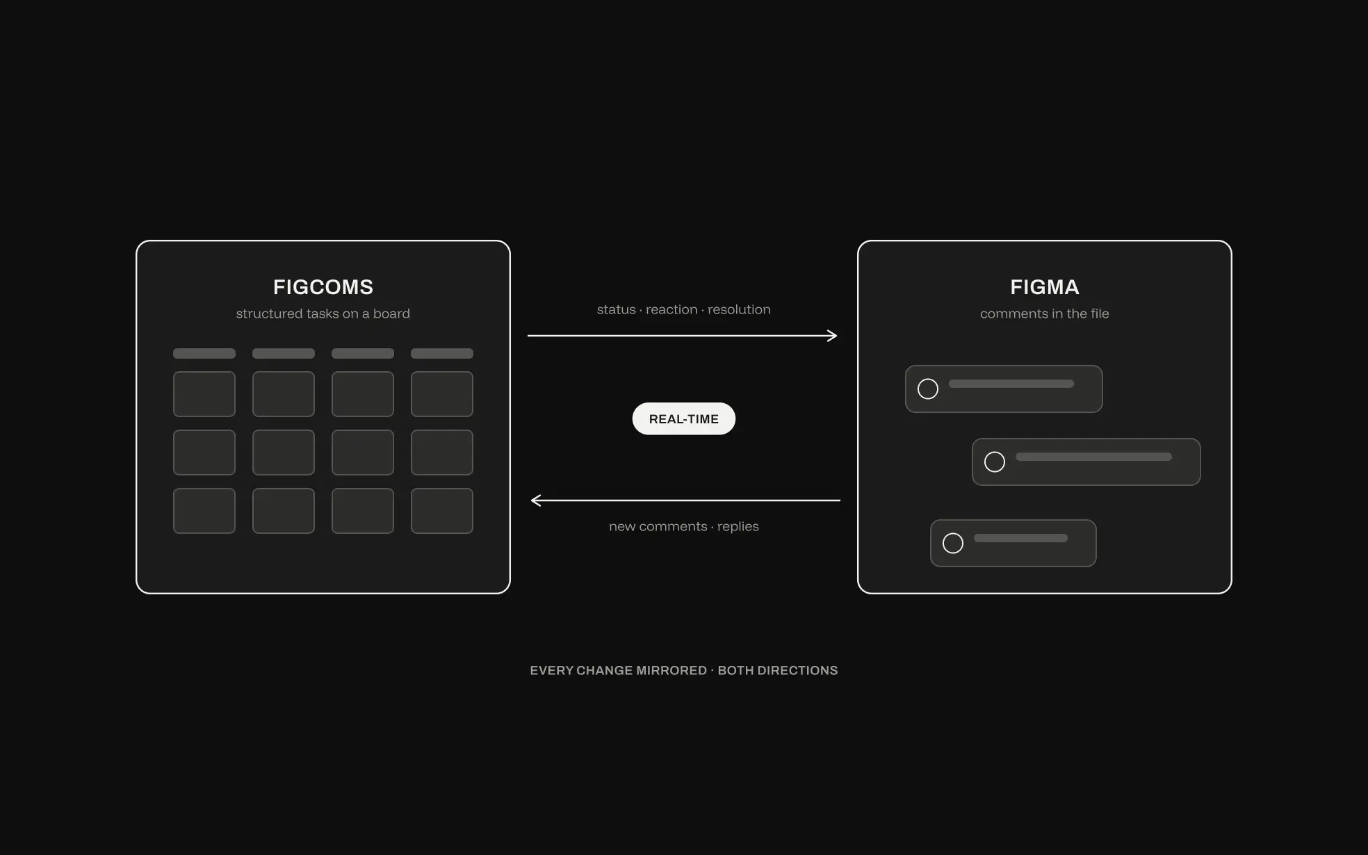
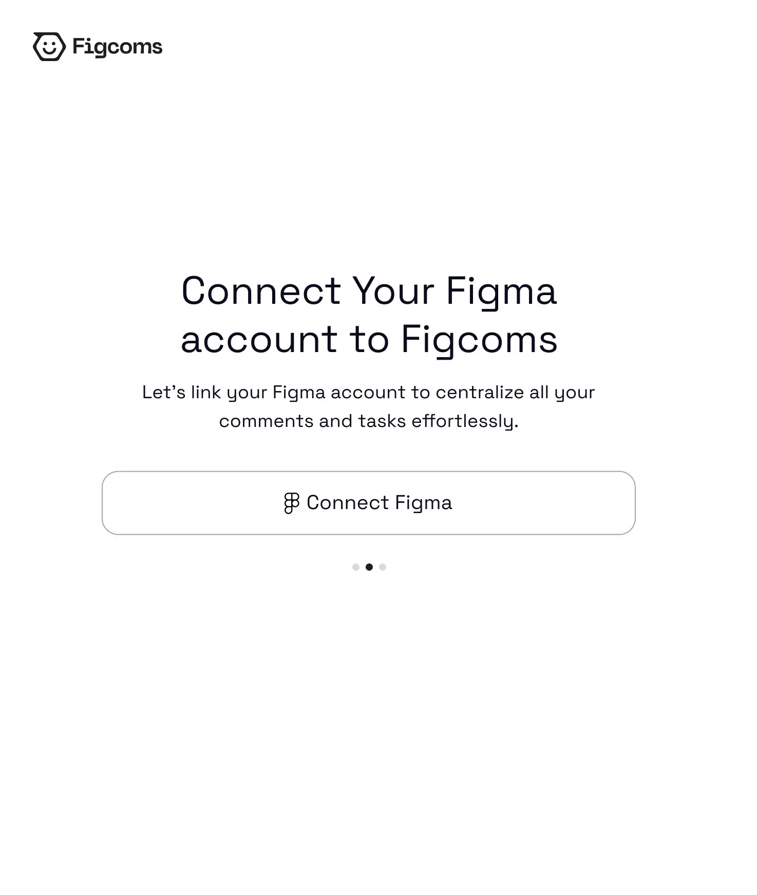
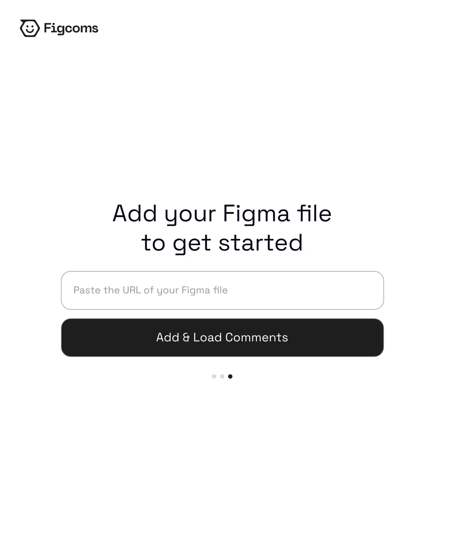
We started by mapping how teams actually use Figma comments. The pain pointed to ownership, priority and continuity, not to Figma itself. That made the core mechanic “one link, instant clarity”: paste a Figma URL and get a workspace built around four states every team already speaks. Soft cards, generous whitespace and a typographic hierarchy let the comment lead, and emoji-based status changes replaced heavy controls. Every comment becomes a task with an owner and a status, and every change syncs back. What the team sees on the board is what they see in the file.
(04)The
Board
A workflow tool that doesn’t feel like one.
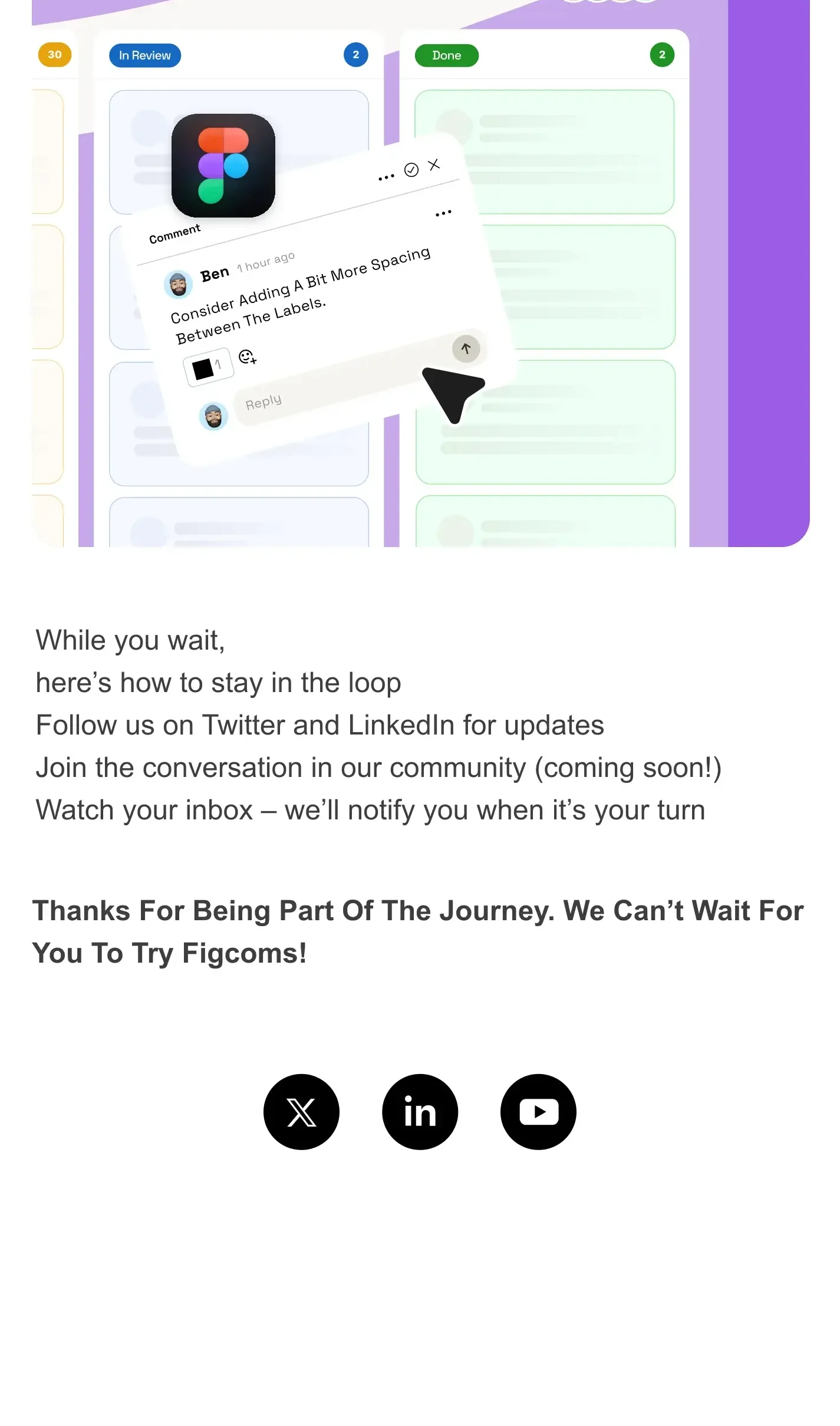
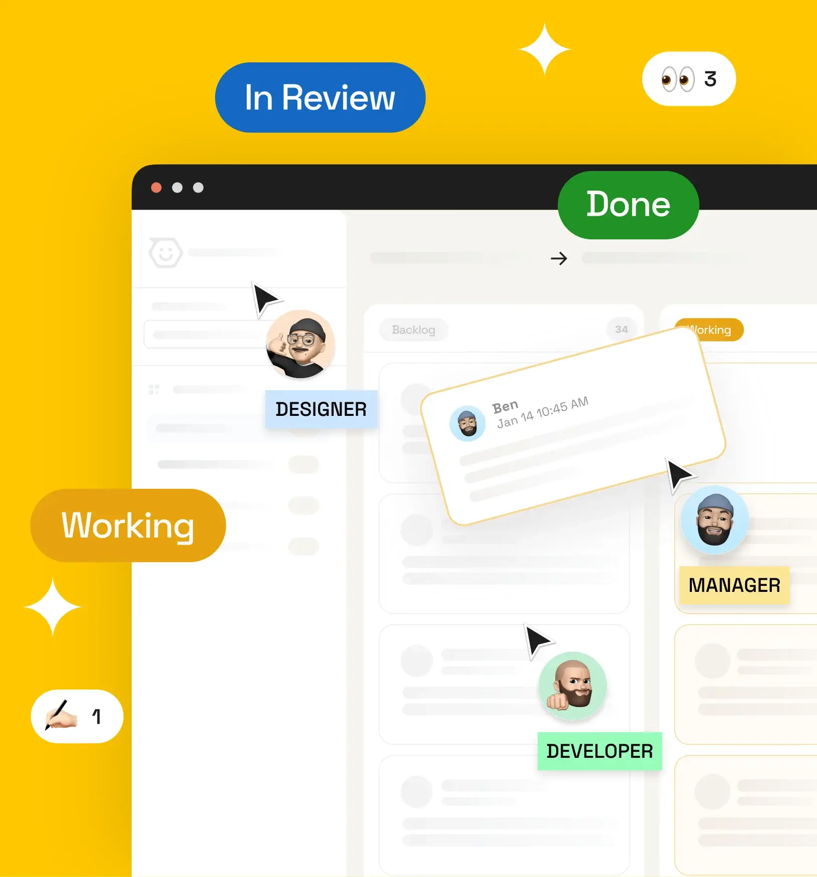
A Kanban-style flow runs across Backlog, Working, In Review and Done. It was stress-tested on real projects before any pixel was drawn. In the detail, soft cards, generous whitespace and emoji-based status changes mean fewer clicks, more personality, and a language teams already speak inside Figma.
(05)Marketing
Material
Product and marketing, speaking one sentence.
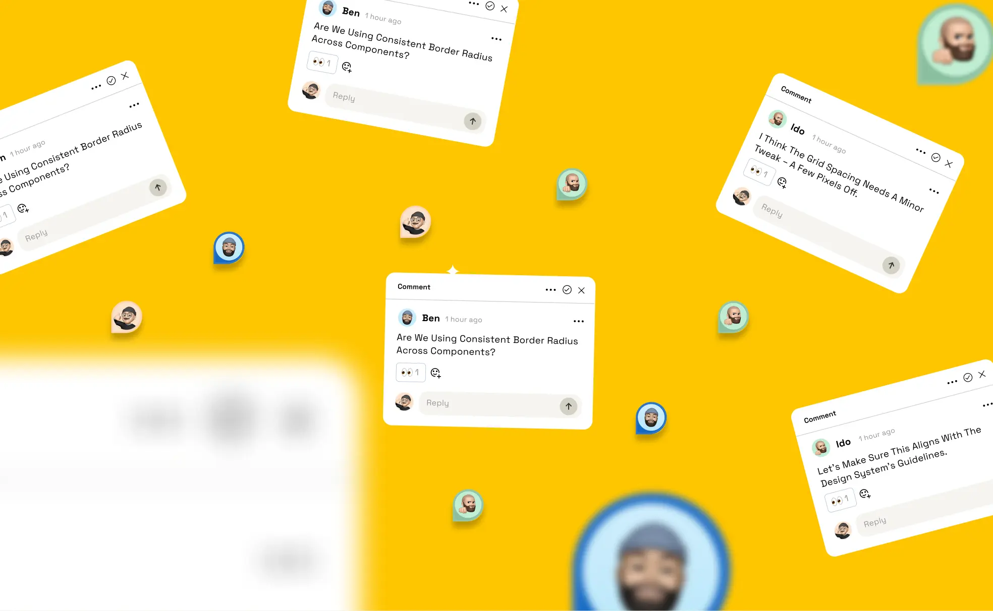
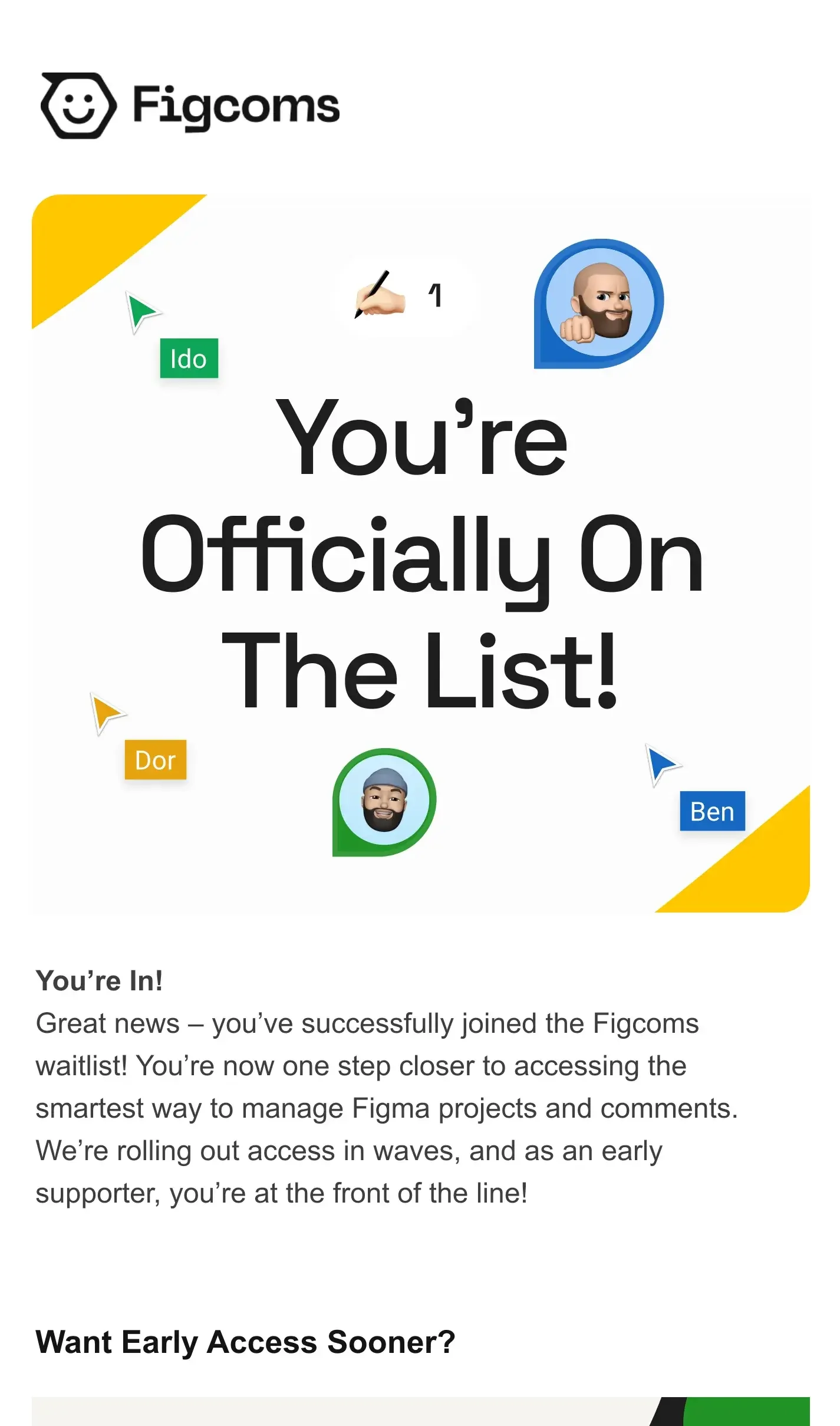
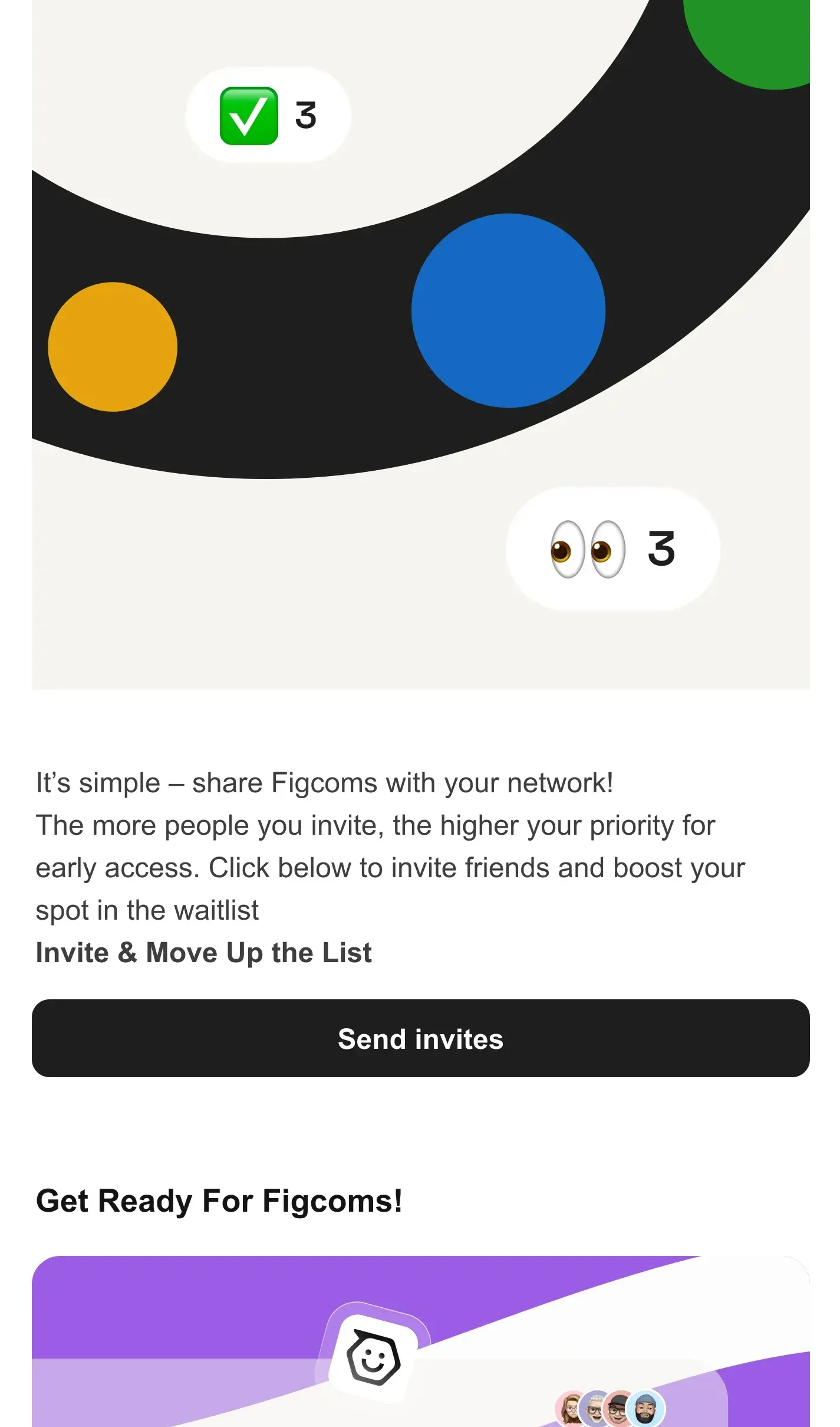
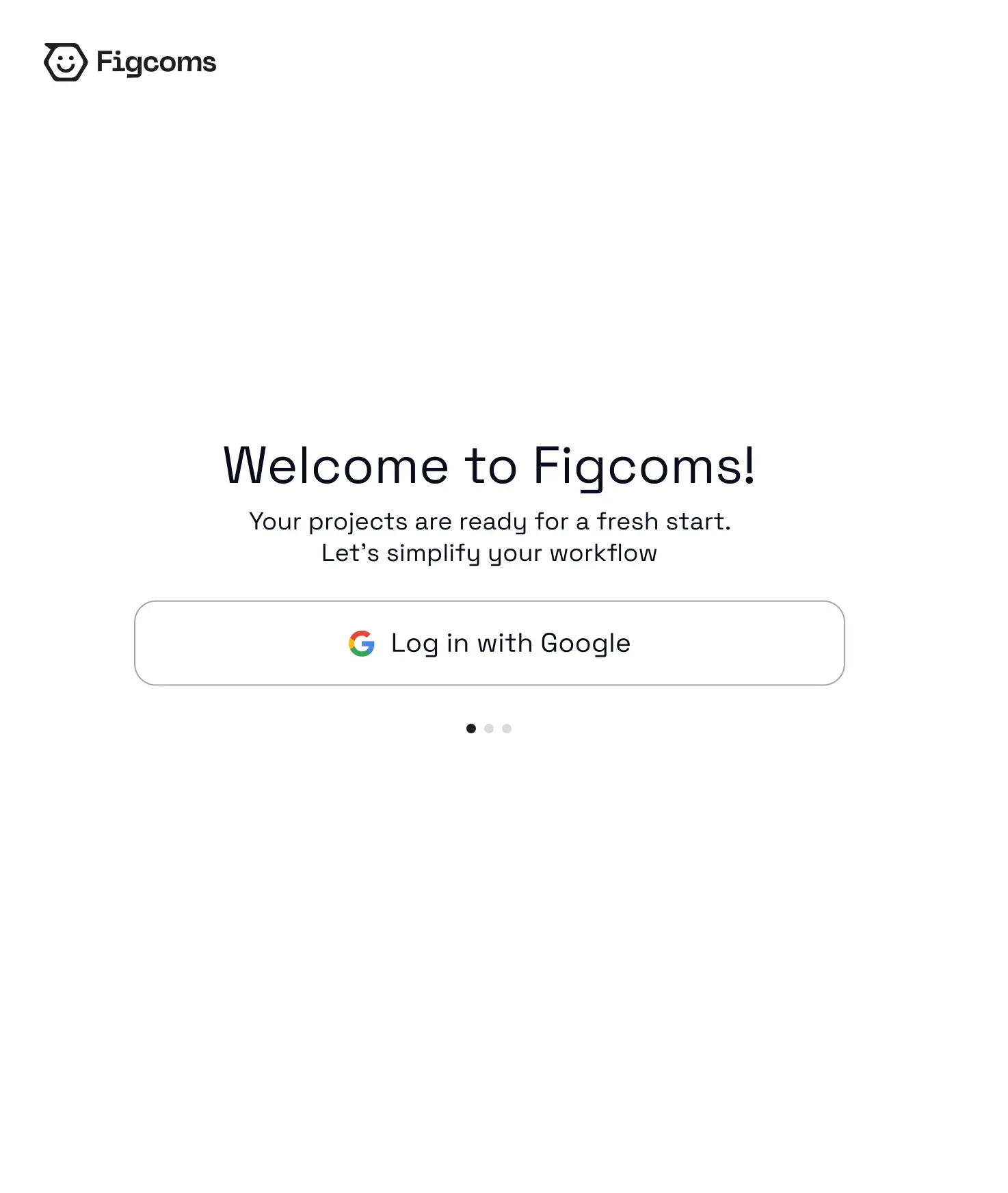
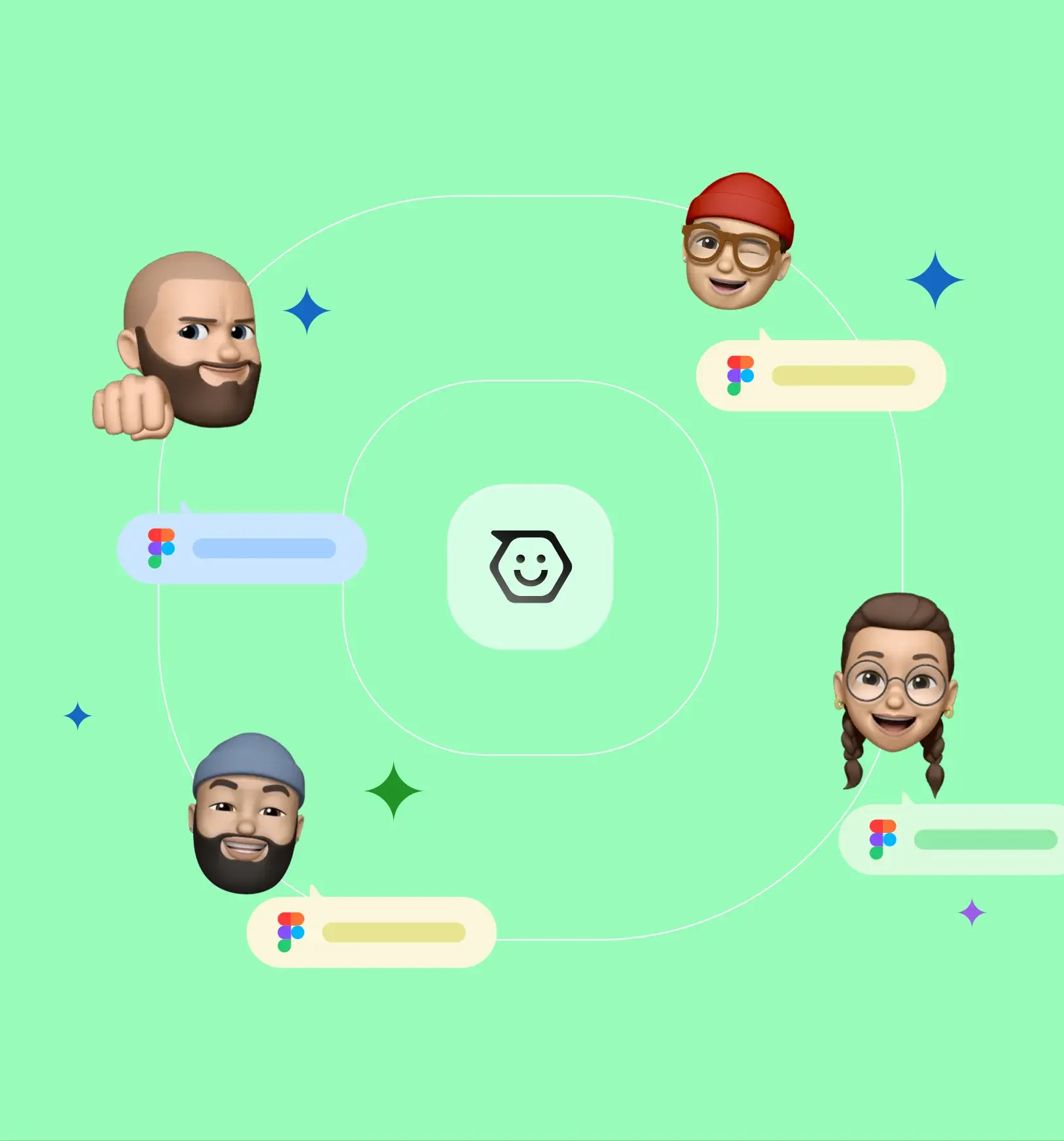
The identity, the motion language and the landing page were built alongside the app, so the product and the way it is talked about say the same thing. The waitlist email, the onboarding steps and the launch visuals all share the board’s soft cards, bright fields and emoji.
(06)Shipped
Two people, four months, #33 on Product Hunt.
Figcoms launched after four months of work by a team of two. It reached #33 on Product Hunt on the day it shipped, and it has been used on real projects ever since.