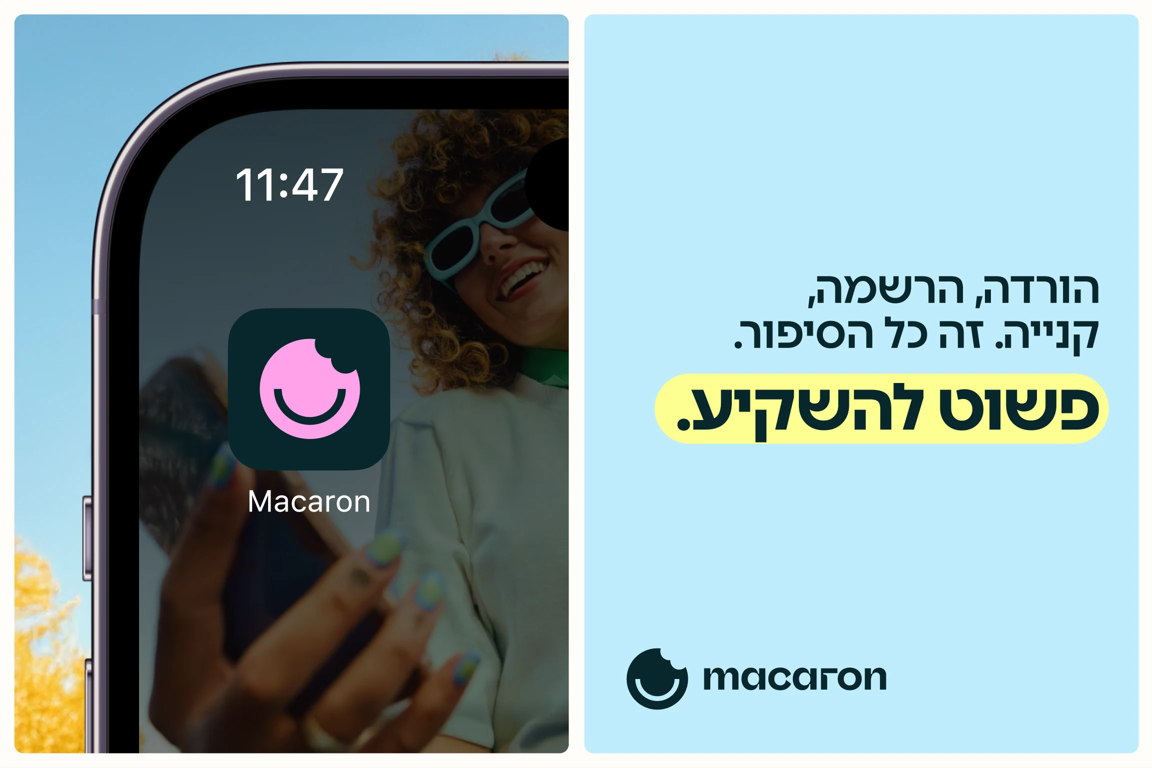
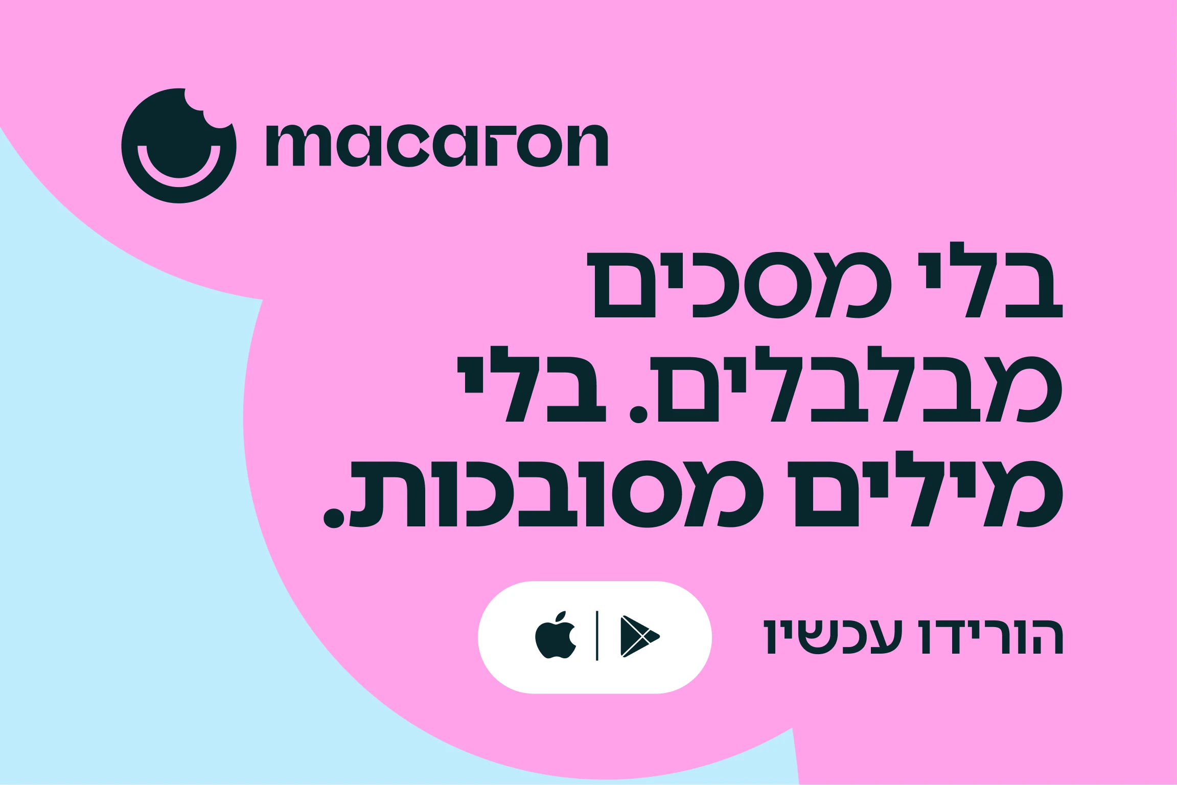
Keep scrolling for the
next case study.
Macaron case study
A brand, a voice and an app for the crypto investing product that speaks plain Hebrew.
← All work(01)Project
Overview
Crypto, for people who never asked what a blockchain is.
Macaron is a crypto investing app with one aim: to make the field clear and open to anyone, including private investors who are not experts. We built it from the first sentence to the last billboard: the strategy and the messaging, the logo and the colors, the app and the launch campaign. The product did not go to market in the end. The brand did get finished, and we think it is worth showing.
(Details)
- ClientMacaron
- IndustryCrypto investing app
- StrategyPositioning and messaging
- BrandLogo, color and graphic language
- ProductApp design
- CampaignOutdoor, digital and social
- StatusConcept, not launched
(02)Strategy
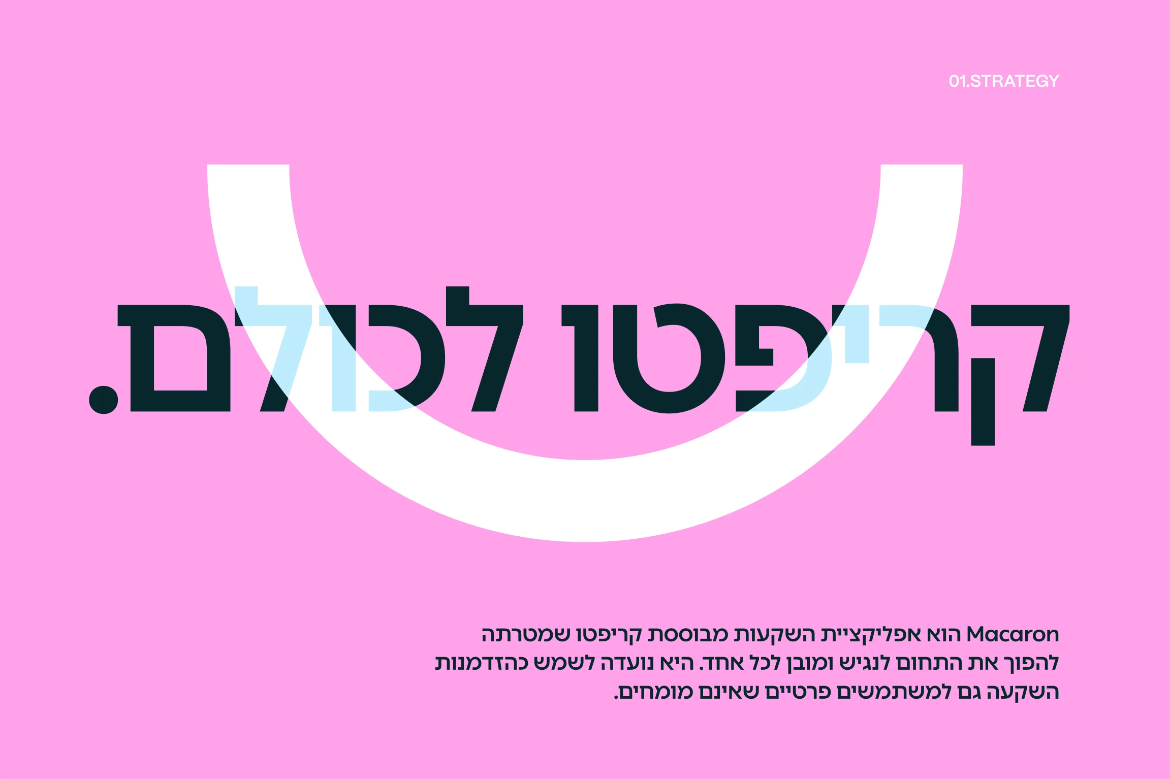
No pose, no jargon. Simply invest.
Crypto brands tend to talk to people who already understand crypto. We went the other way and simplified it. The brand stands for clarity, freedom and access, so that investing in crypto feels as ordinary as opening a savings account. That decision set everything that followed. If the promise is simplicity, the name, the mark, the screens and the headlines all have to be simple too.
(03)Messaging
Here to hold your hand, not your money.
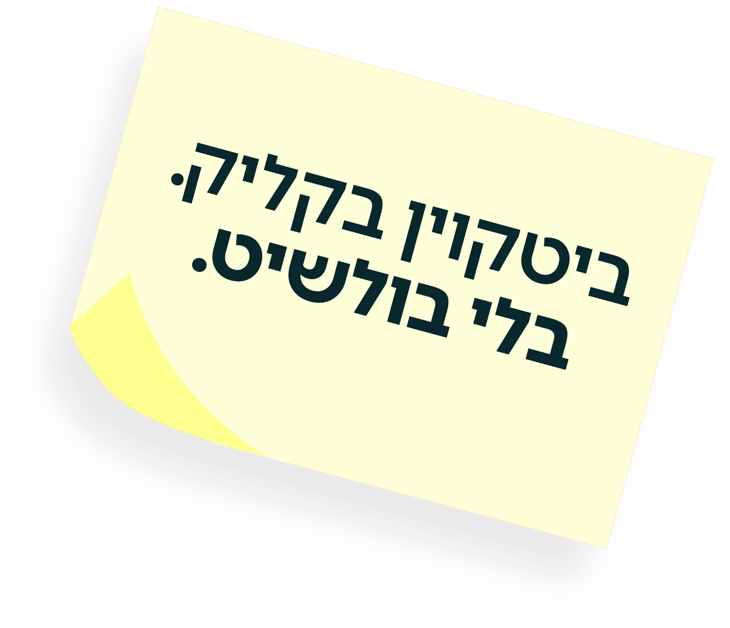
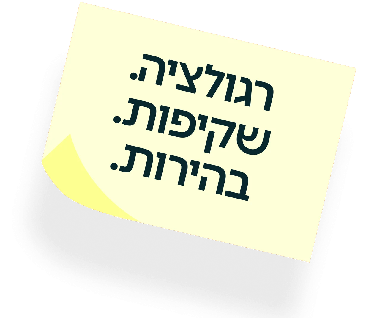
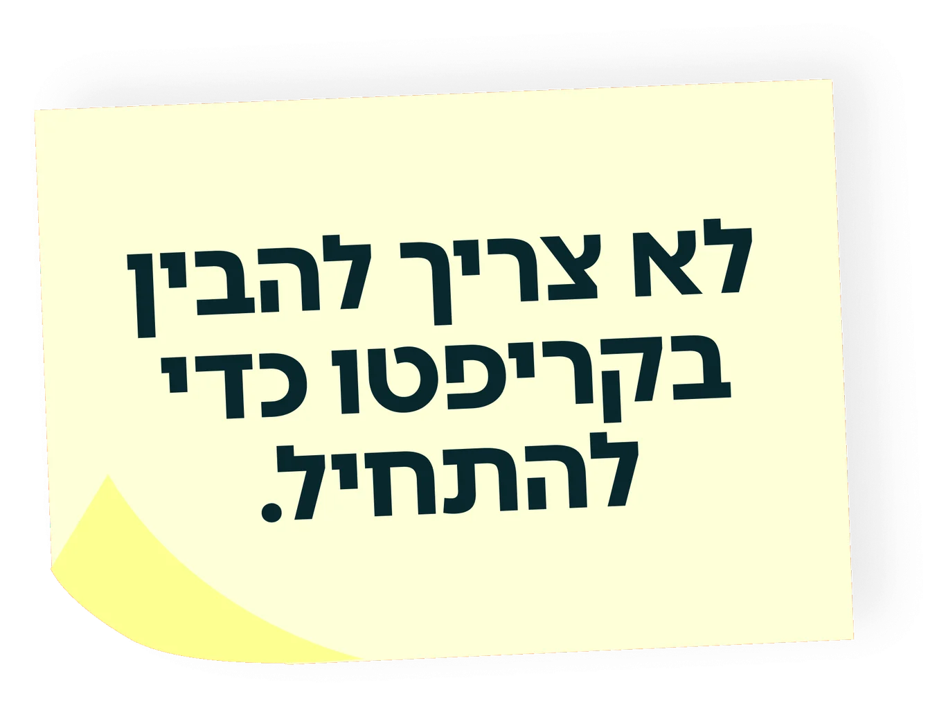
The voice is short, Israeli and a little cheeky. Bitcoin in a click, no bullshit. Your coins, in Hebrew, in a second, in the bank. You don’t need to understand crypto to start. Every line does the same job: it takes something that sounds complicated and says it the way a friend would. Regulation, transparency and clarity are in there too, said just as plainly.

(04)Color
A palette you could eat.
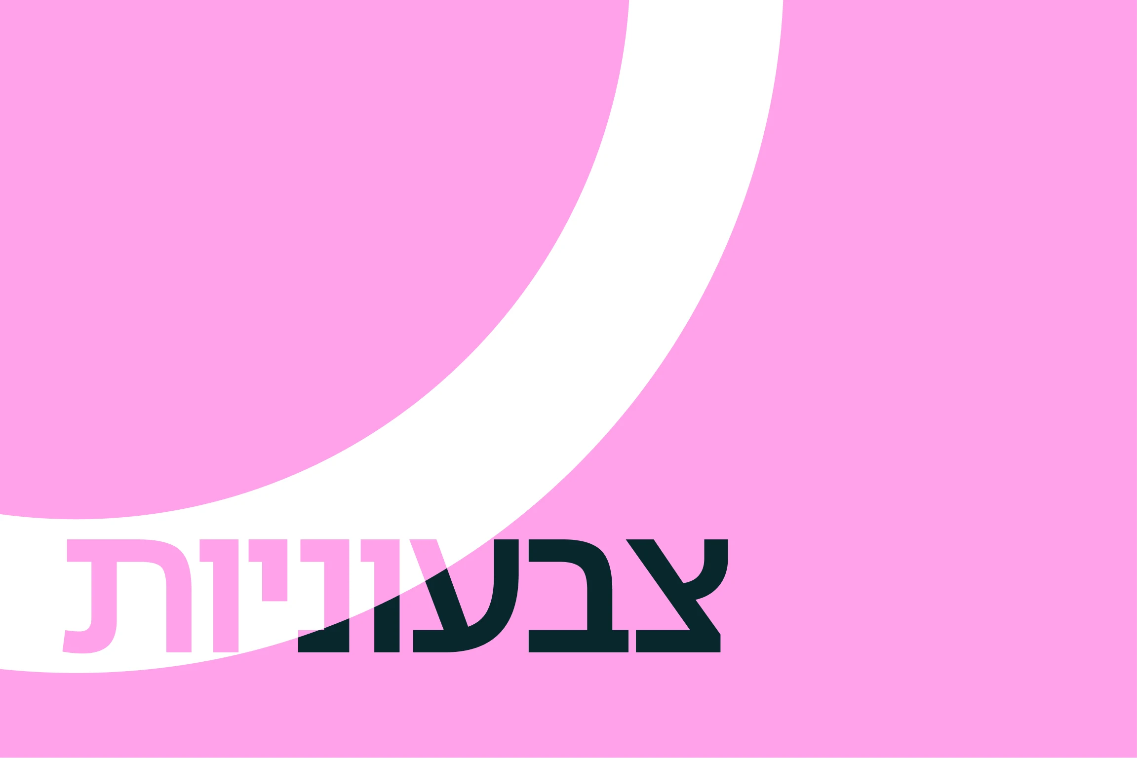
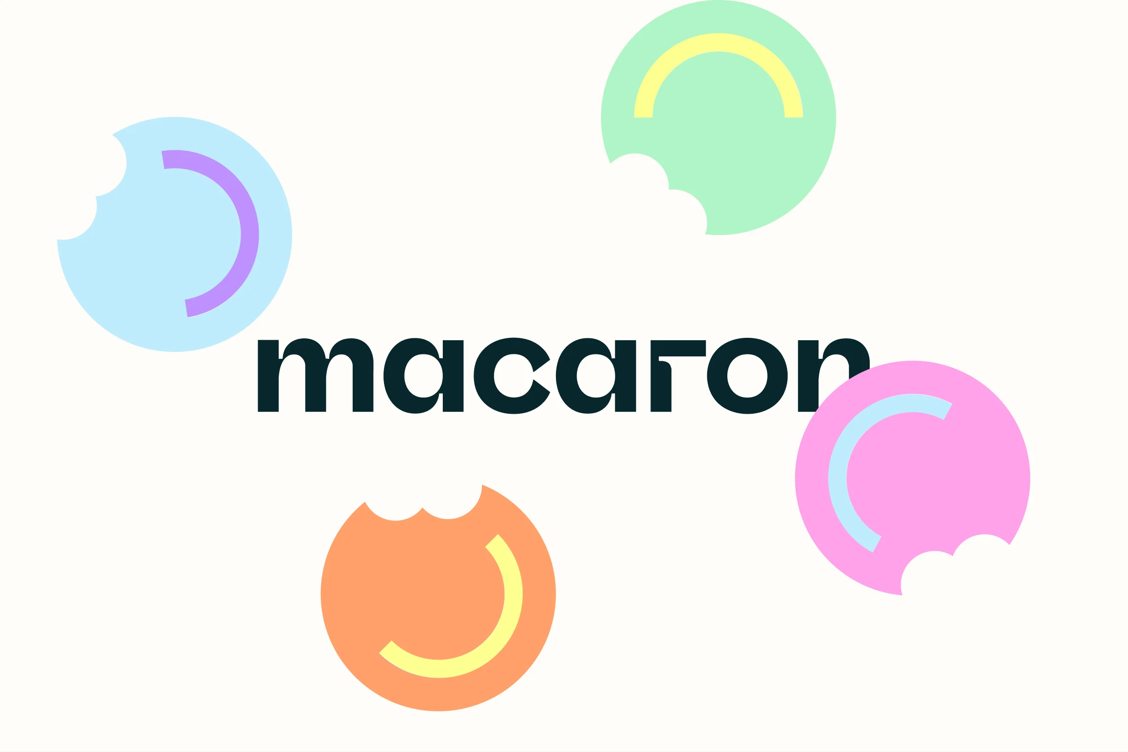
Finance usually dresses in navy. Macaron dresses like a pastry box: candy pink, sky blue, orange, lemon yellow and mint, all anchored by one deep ink green that carries the type and keeps the sweetness serious. The leading colors are the ink, the blue and white. The four brighter ones rotate through campaigns and screens, so the brand can change mood without changing character.
(05)Logo
Three routes, one smile.
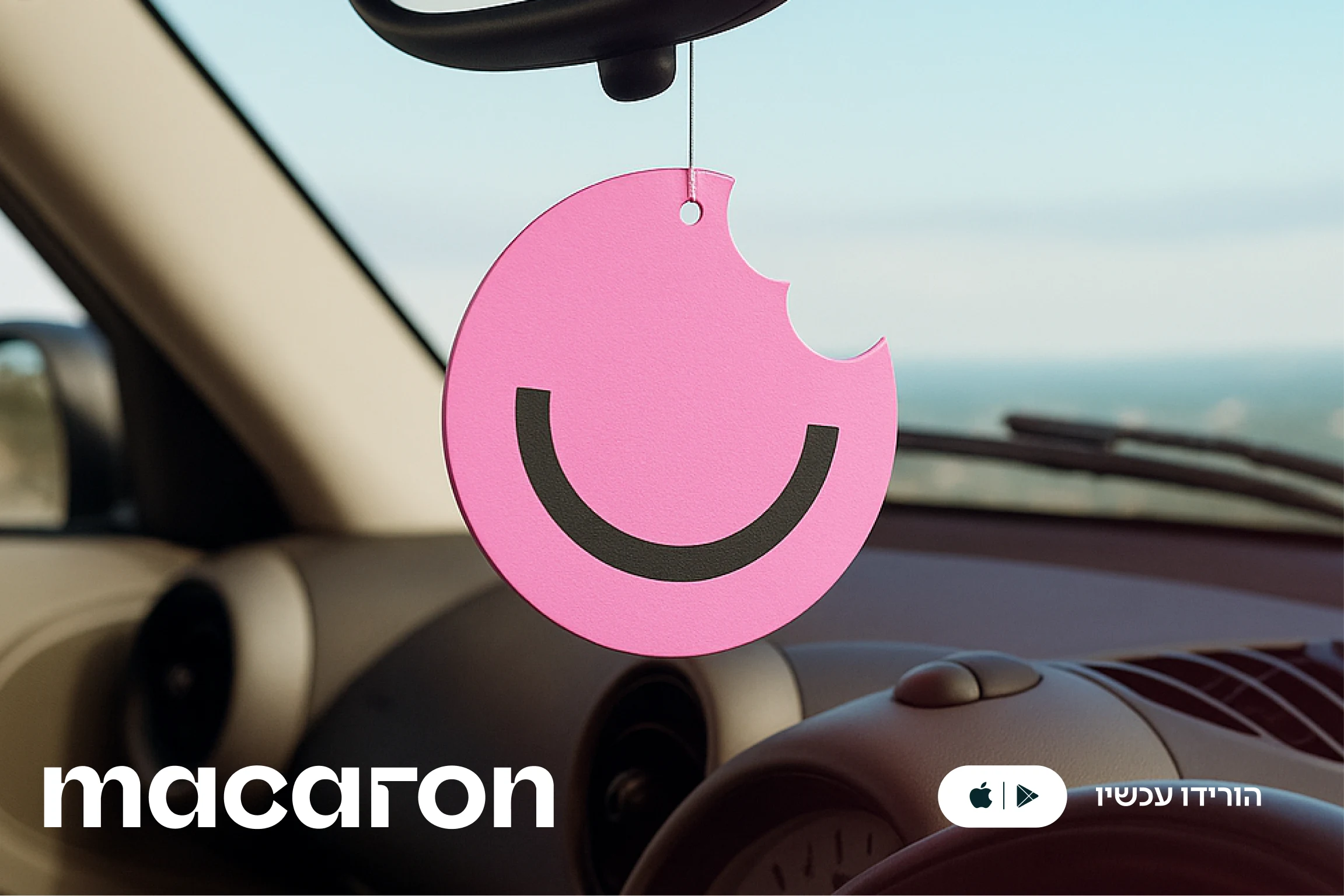
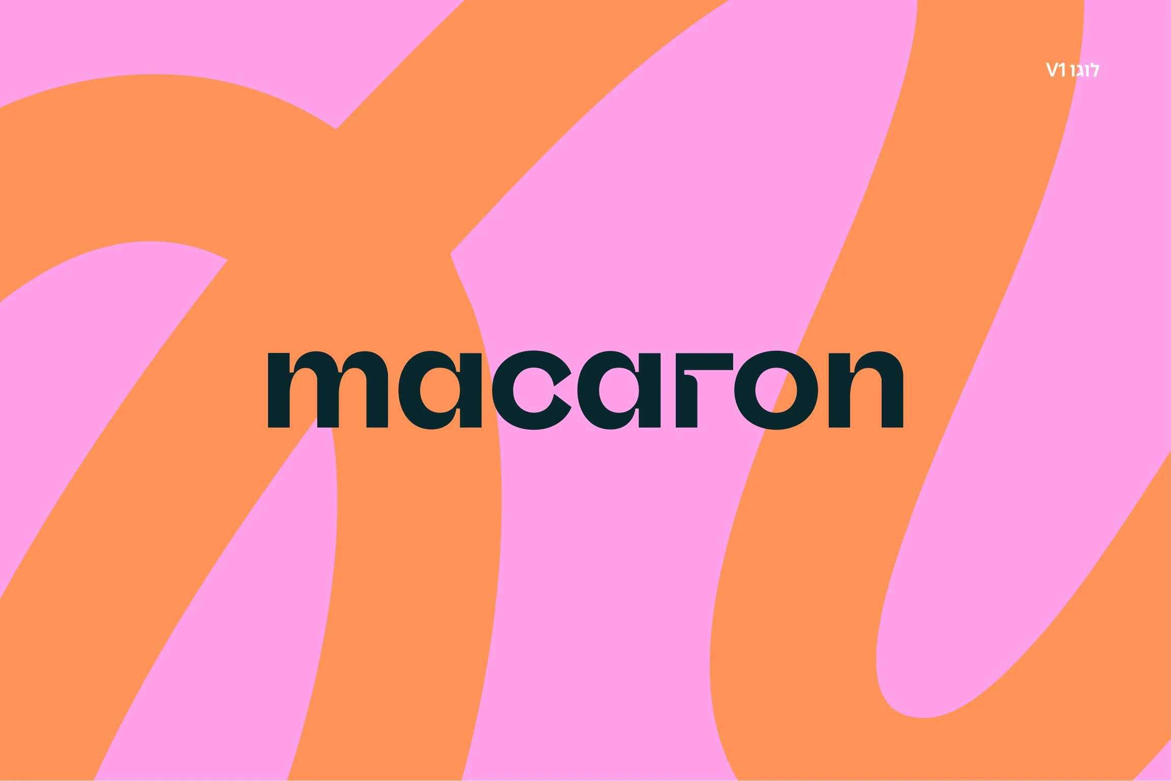
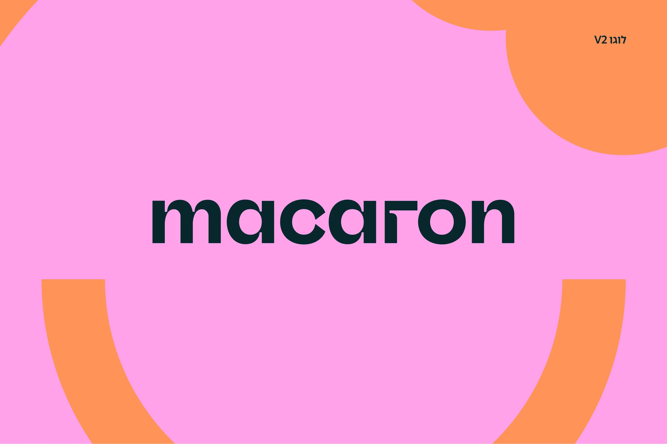
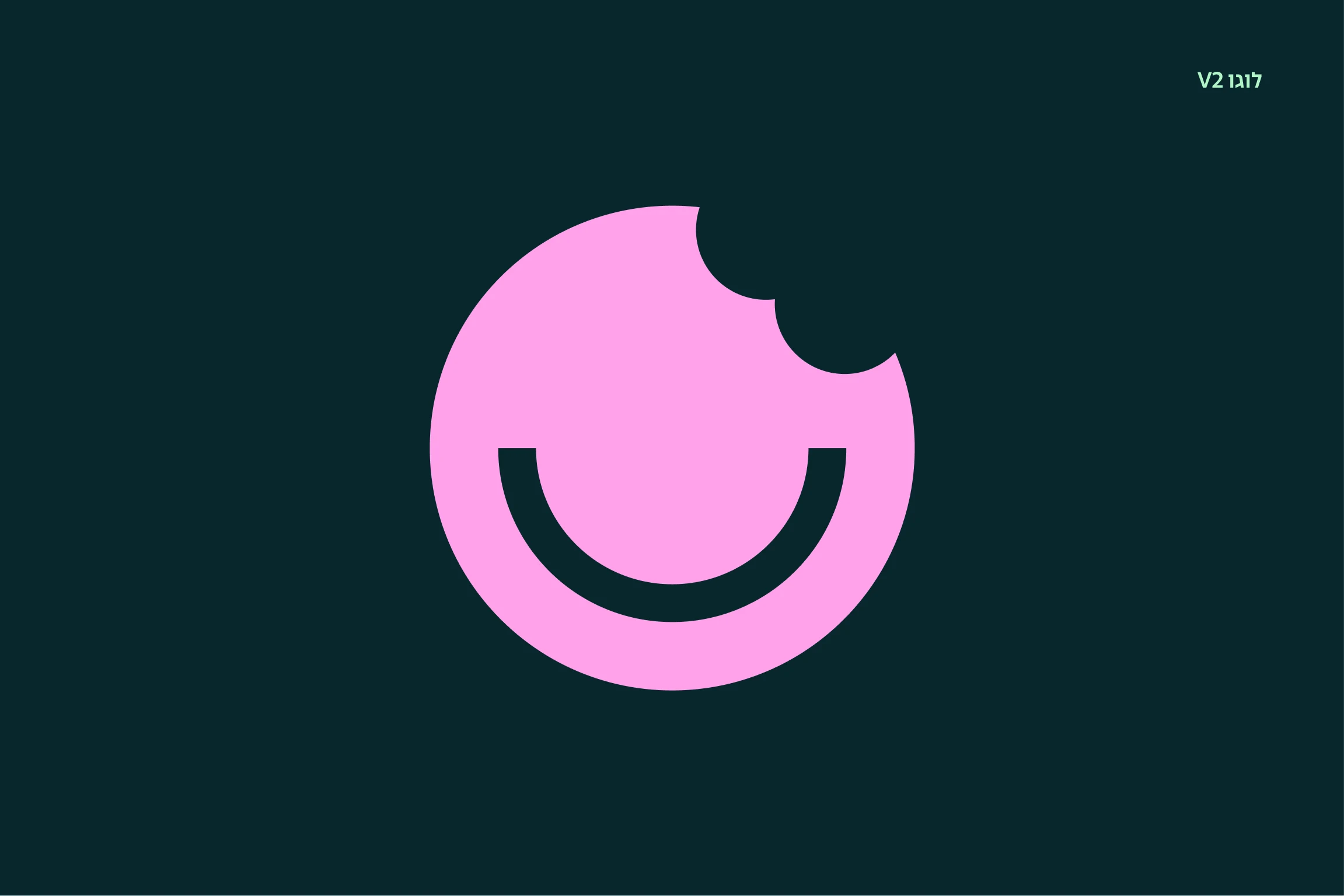
We explored three directions for the logo. The first is all wordmark, with a turned r and a ribbon that loops through the layout. The third frames people inside the bitten shape. The second is the one that stuck: a macaron with two bites taken out of it and a smile left behind. It reads as a cookie, a coin and a face at once, and it works at every size, from an app icon to an air freshener hanging in a car.



(06)Product
First click, fresh start.
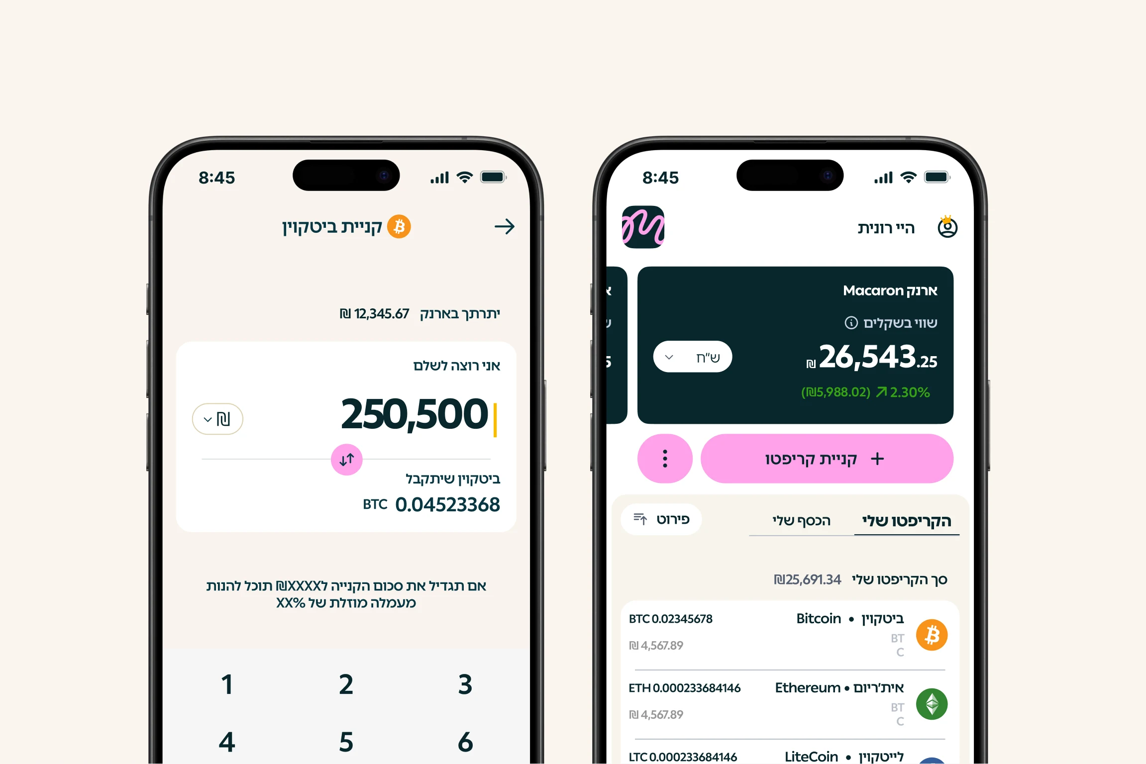
The app keeps the promise the brand makes. One amount, one button, one confirmation. Balances come first and in shekels, the actions sit where a thumb expects them, and the language on screen is the same language as the billboard. The symbol turns up at the moments that matter: on the home screen, and when a purchase goes through.
(07)Campaign
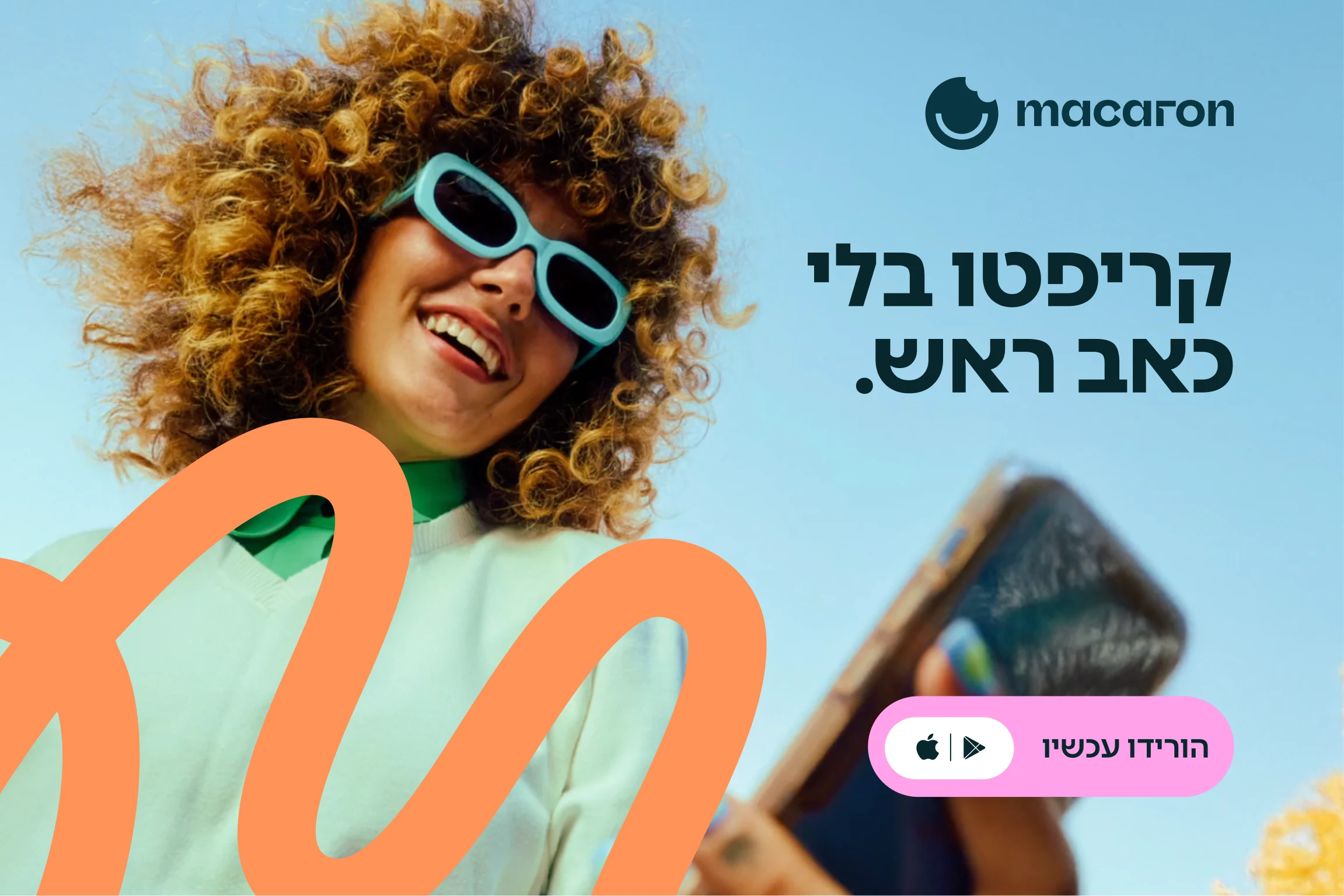
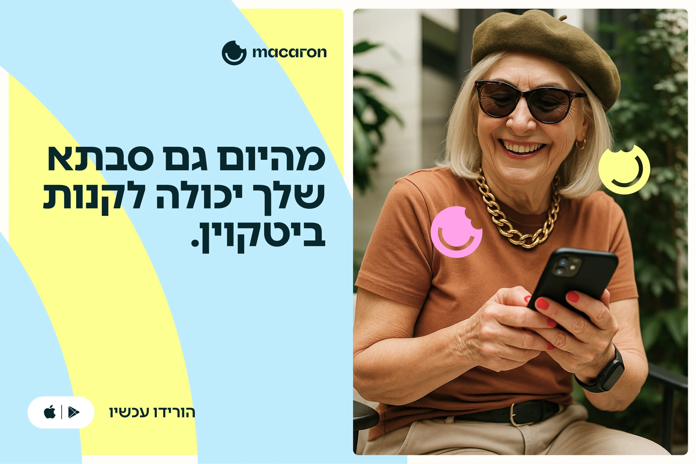
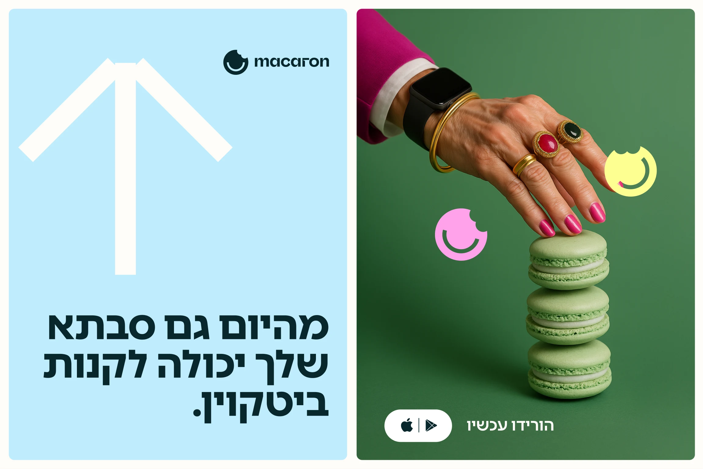
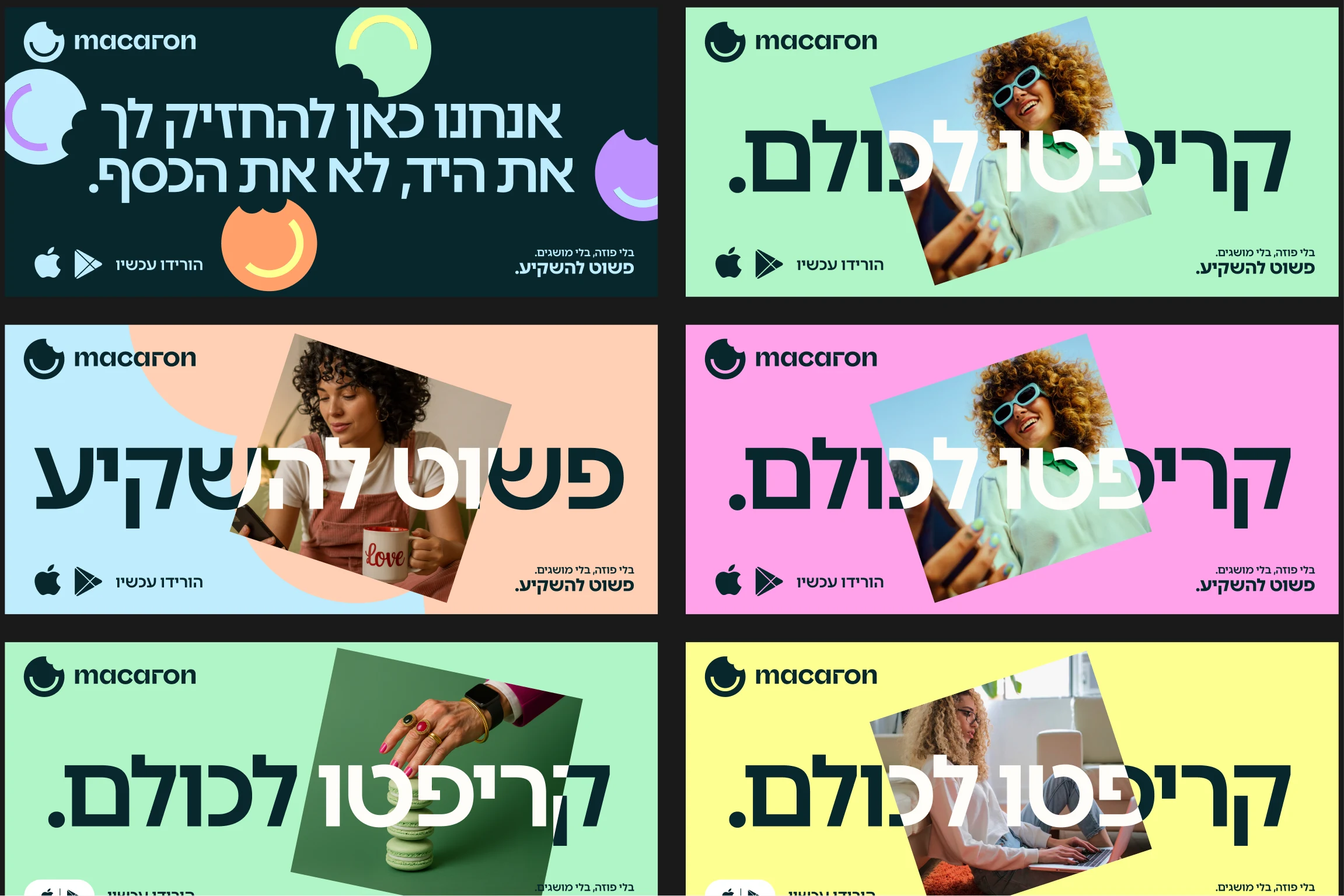
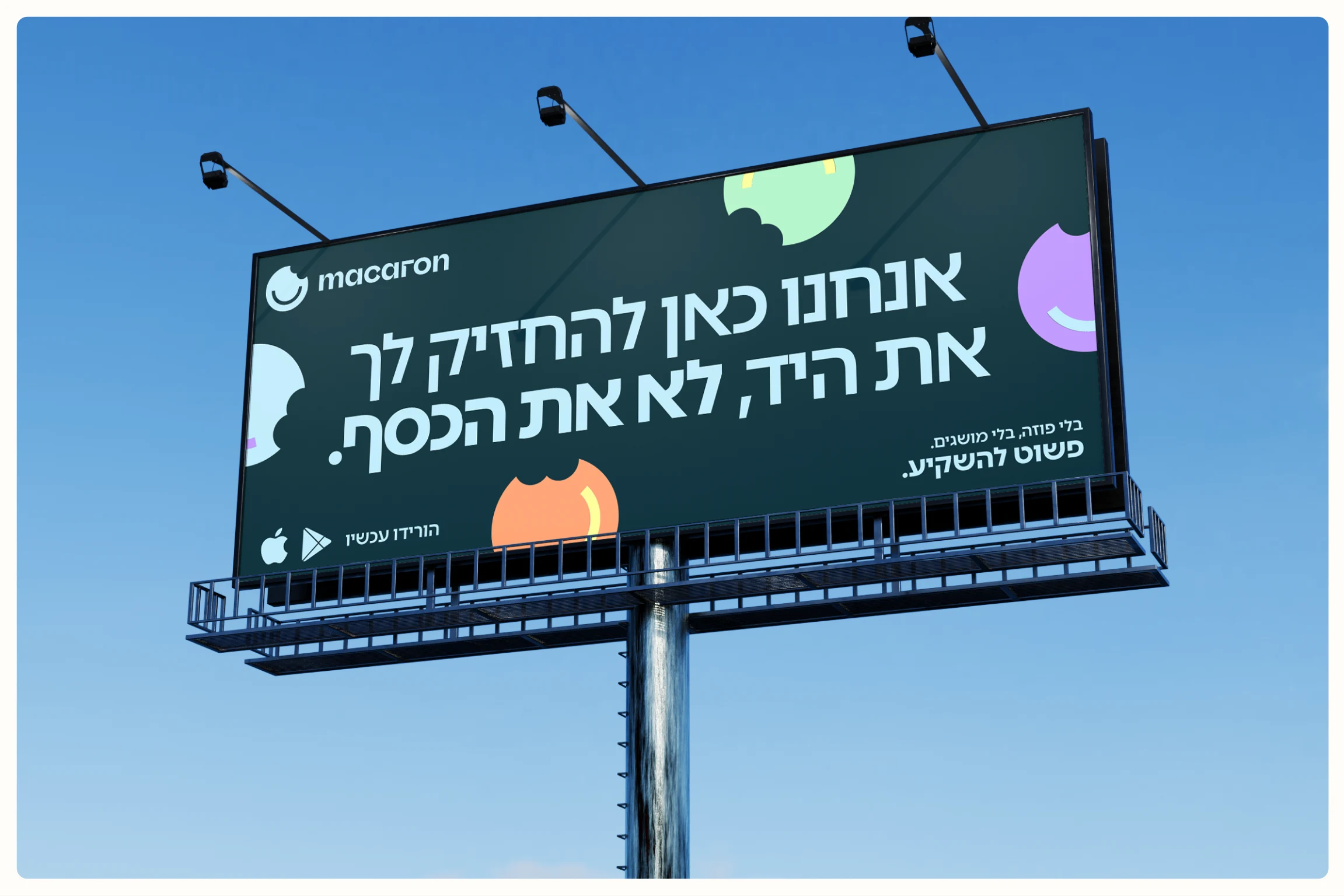
From today, your grandmother can buy Bitcoin.
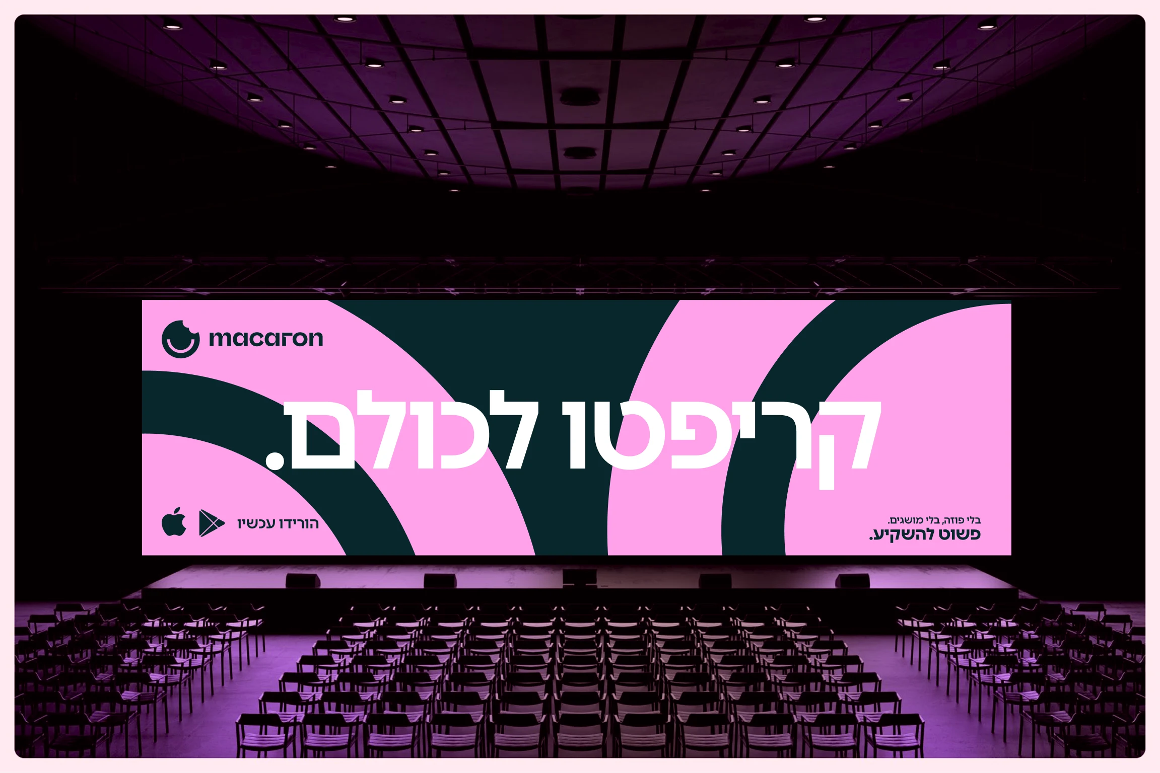
The campaign takes the strategy outside. The headlines are big and the faces are happy. Macarons get stacked like coins, and a grandmother is perfectly at home with her phone. The system stretches from a highway billboard to a story ad without losing its shape: one headline, one cookie, one button. Crypto without the headache.